If you plan on building a website, you should know that, beyond color schemes and images, the fonts you use also play a crucial role. Typography is an essential branding element with a significant impact on your website’s performance, search engine optimization efforts, user experience, and more. In website design, fonts should be one of your focal points and not a simple afterthought. For this reason, website designers recommend you use web safe fonts. You might want to go with some cool fonts you or someone else created, but will they help you reach your purpose? Or are they difficult to read and slow down your website? Today, we will answer some of the most pressing questions regarding safe web fonts and deliver you a list of web fonts that will make your website look great while also remaining user-friendly.
What Are Web Safe Fonts?
Simply put, web safe fonts are the fonts you find installed across all devices and operating systems. When you build a website, you might want to stand out from the crowd and turn the typography into a branding element for your blog or business. However, Internet users might see a completely different font than the one you used in the first place.
Web safe fonts are stored locally and do not negatively affect your website’s loading times. Moreover, no matter what web fonts you use, they should be easy to read across all devices, improve user experience, and transmit the brand message you want them to convey.
On the other hand, everybody is using web safe fonts. They are so omnipresent that we are all a bit tired of them. Who likes Times New Roman anymore? It is boring, and the only message it coins is that people do not care about typography in their website design plan.
However, there is no need to fret about this any longer. We did the homework and came up with the ten best fonts for websites that look amazing!
Nevertheless, before you pick any of them, do a bit of research on the best uses of such fonts. Some work better for magazines and modern blogs, while others have a great history of improving user experience and ROI for eCommerce shops and other online stores.
10 Best Web Safe Fonts for Your Website
Using the best web safe fonts that look the same across all OS versions and devices is a wise choice, no matter what new and innovative design trends you want to include on your website design. According to statistics, about 70% of customers say that page load speed is crucial for their online shopping experience. If a page does not load as expected, customers will close that tab without ever returning to that online store. You can improve page speed in plenty of ways, but using web safe fonts is one of the easiest ways.
You should pay attention to page load speed, readability, and accessibility across mobile devices, particularly if you want your eCommerce business to stand a chance in Google’s Mobile-Friendly paradigm. But for now, let’s take a look at the best web safe fonts you can use for unparalleled design and user experience!
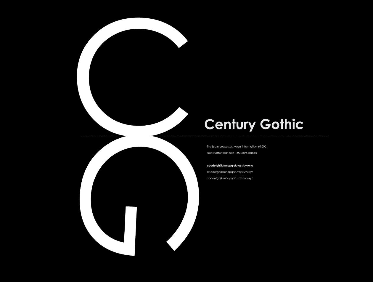
1. Century Gothic
This font, despite its name, has a clean, polished look that works amazing with new website design trends. Century Gothic is a geometric sans serif font that makes a great visual impact when you use it for headlines, subheadings, even product names. It is a web safe font, and you will find it across almost all Microsoft and Apple operating systems.
2. Garamond
Inspired by 16th-century Parisian engraver Claude Garamond, this serif font compels web designers, bloggers, and book publishers with its softer, rounder edges. While the font resembles Times New Roman, it has a cleaner, more modern look. Even if it is an old-school font, its contemporary variety is a Microsoft staple and a pleasant surprise for readers.
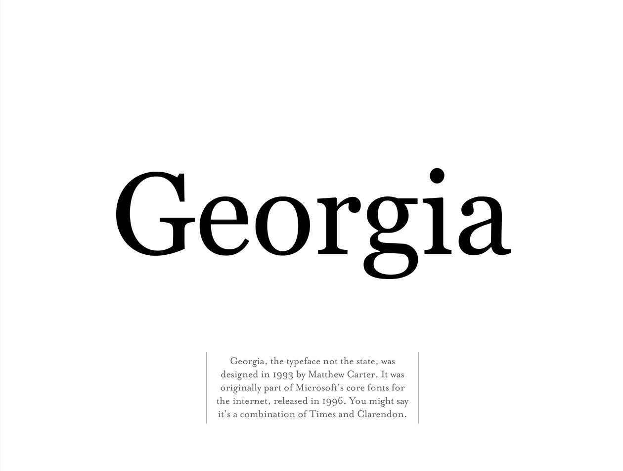
3. Georgia
If you ever used the Georgia font, you may have noticed that the letters are larger-than-usual compared to fonts of the same size and family. Georgia resembles Verdana in this regard, although the font design draws its inspiration from Garamond. This serif font makes text blocks easier to read. The rounded edges also give off a warm and familiar feeling. For this reason, Georgia and Garamond make the go-to font choices when you write content on your blog or display product descriptions on your eCommerce website. The best part is that you will find Georgia on virtually any Microsoft or Apple device/OS.
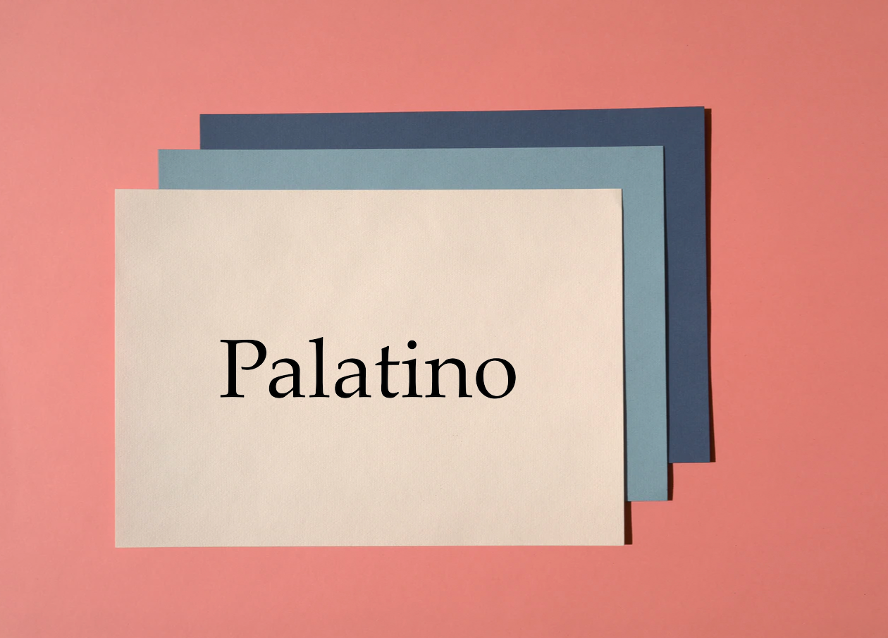
4. Palatino
Have you read a printed book recently? Or maybe you have checked out a printed ad or leaflet for some commercial offer? You most likely read blocks of texts written in Palatino. It makes an excellent branding font because it looks great both online and in print.
This font dates back to the Renaissance, and it is still one of the cleanest, most beautiful, and naturally readable fonts available. The old-style serif comes with varying stroke weights and shapes, so consider using it for headlines, subheadings, and body text. It may not make an excellent choice for displaying eCommerce product names, especially if you want to achieve a streamlined, aligned, perfect mobile user experience.
5. Verdana
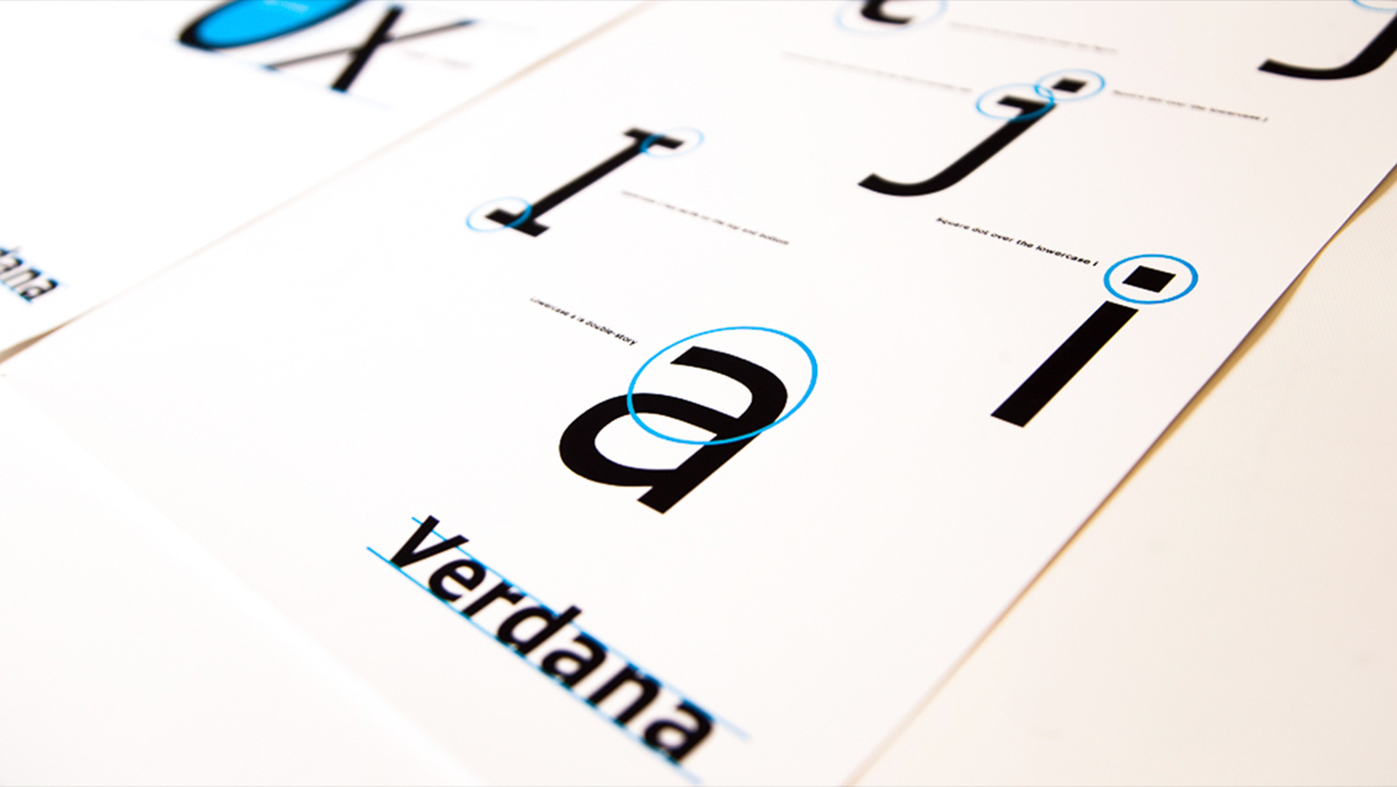
Verdana takes the cake for being a true staple among all the best web safe fonts out there. The simple sans serif lines, slim elegance, and large natural size make this font an excellent choice for large readable bodies of text, such as blog articles and lengthy product descriptions. Verdana has been a Microsoft staple since the mid-nineties. You will find it now across all Apple and Microsoft operating systems and devices.
6. BrushScriptMT
You know what they say, great essences come in small bottles. Or so they should. Brush Script MT is a cursive font designed to mimic handwriting. It is sophisticated, elegant, and one of the best safe web fonts for HTML and CSS. However, it can be hard on the eye for some, so use it sparingly - don’t spread it across all of your web pages. Also, keep in mind that Apple and Microsoft devices do not universally support many cursive fonts. Using a cursive in the body of an article harms readability, which, as you may know, plays a crucial role in website usability and user engagement.

7. Trebuchet MS
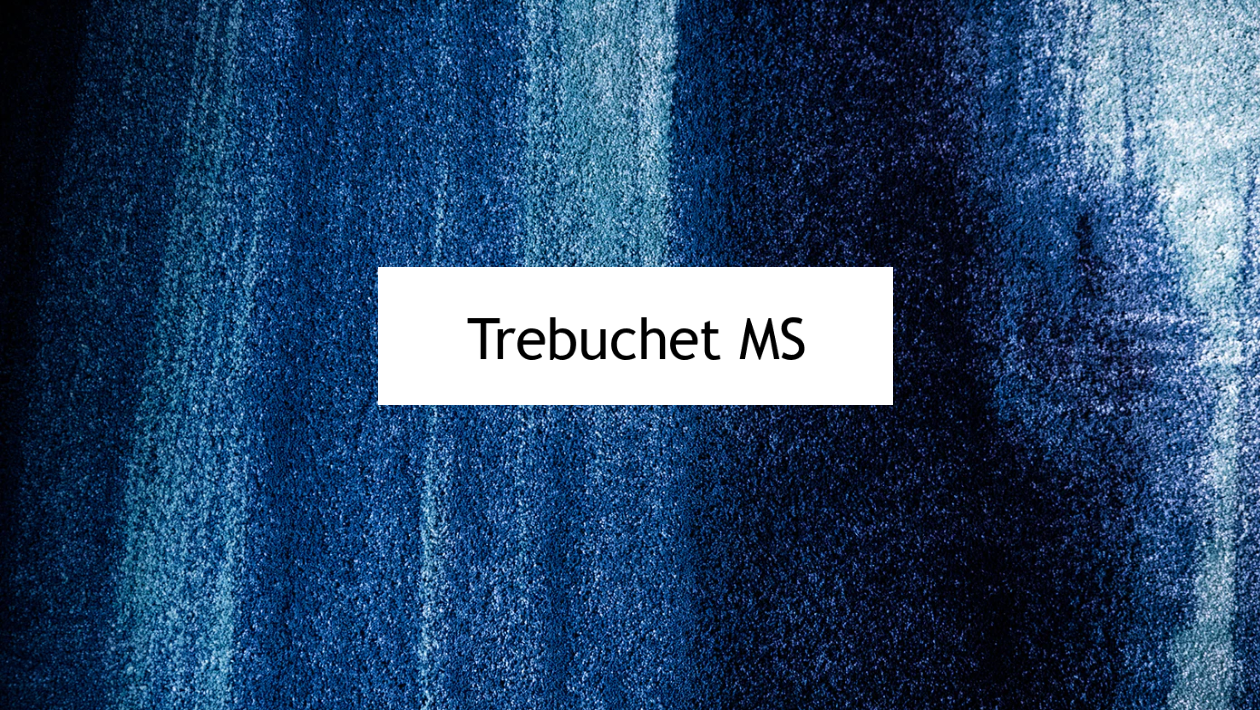
As safe web fonts go, Trebuchet MS is a sans serif about Microsoft’s web package of core fonts. Compared to other sans serif fonts, this one has a slimmer, more elegant shape, making it an excellent option for online and printed content for impeccable brand consistency. Compared to the more popular Arial or Helvetica fonts, this feels less robotic and cold. On the contrary, it instills a warm, humane feeling in readers’ hearts. For this reason, our recommendation is to use it in blog posts and articles, eCommerce product descriptions, responsive landing pages, etc.
8. Lucinda Sans
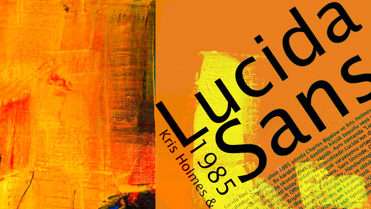
The Lucinda font family has plenty of members and cousins, but Lucinda Sans (a sans serif) font is an excellent choice if you have plenty of headlines, subheadings, and CTAs to write. A clean-cut, humanist, and warm font, you will find Lucinda Sans on websites with a more playful, out-of-the-box, human flair. You will find it on almost all Microsoft and Apple OS versions and devices.
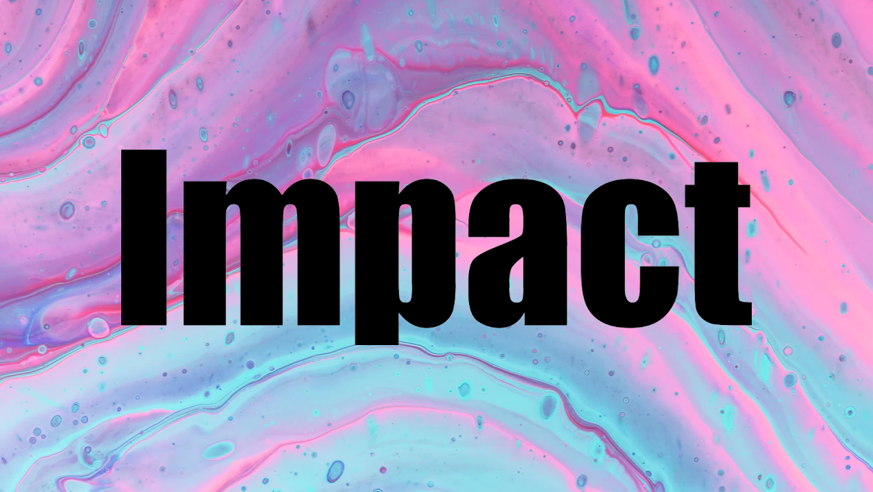
9. Impact
You have probably come across this thick, bolded, sans serif font across the Internet (and maybe in print too). As its name suggests, this font’s mission is to make an impact, capturing the reader’s attention. For this reason, you will see it in headlines and CTAs, but not in body texts. Impact is one of the oldies, as it showed up in 1998 as part of Microsoft’s core fonts for the web pack. It is a true type font, supported by both Microsoft and Apple, making a huge comeback in a world in love with bold website design.
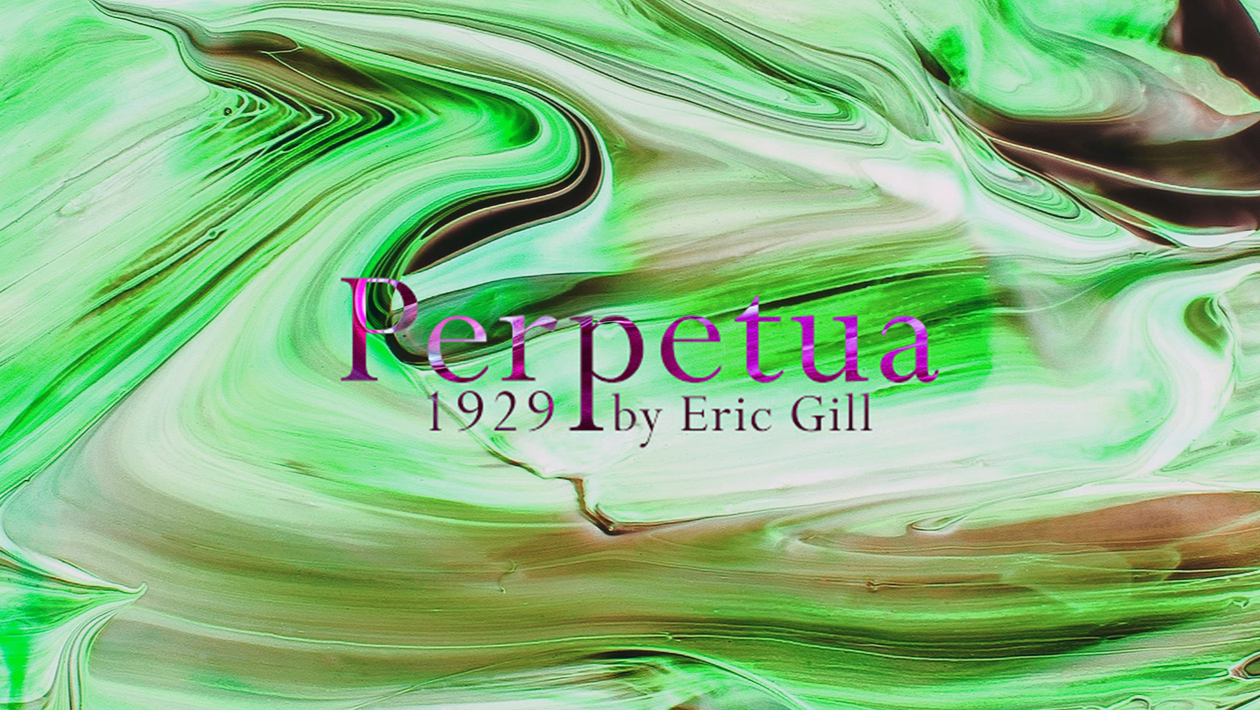
10. Perpetua
Seen as a cooler font with an interesting backstory, Perpetua, is one of the legacies left to us by English sculptor Eric Gill. It is a sans serif font with a unique design and an elegant demeanor, making it an excellent choice for a creative, playful, youthful website. It is a Windows font, but Apple has a fallback font in the shape of Baskerville, a very close relative to Perpetua.
Web Safe Fonts for Websites vs. Professional Fonts for Websites
Most beginner entrepreneurs wonder, “what is the most professional font for a website?” when they start building their online assets. Well, in short, Lato is a web font designed with corporations in mind. It feels human and inviting and has an elegant seriousness that blends in perfectly with big companies. Nevertheless, Lato is not a web safe font. It may look different across operating systems and devices.
On the other hand, Helvetica is one of the most popular web safe fonts out there and one of the most versatile. It is the only font which has its own documentary and over 100 variations. We did not mention Helvetica above on our web safe fonts list because it is one of the many default choices all website builders have, and you are probably familiar with it already. It looks great, though, so you should give it a try.
A professional website font is not necessarily a web safe font. Here is your takeaway from this short guide.
Speaking about web font differences, you should also know that Google fonts are just web fonts. They are not inherently web safe fonts, even if all of them look amazing and you would want them for your website.
To use one of the many Google Fonts, you first need to download a file and install it on your website. The issue here is that the CSS file you fetch from Google and install on your website may significantly slow your page load speed. Since the search engine itself puts a lot of weight on page speed when it comes to ranking factors and user experience, you should rely on safe web fonts more than on alternative web fonts or Google fonts.
When it comes to Ucraft, we already provide some of the fonts discussed above with our Google Fonts integration. However, you also have the freedom to upload any additional font of your choice when creating and designing a website with our builder.
Don’t have a website yet? Build one now!

