This week, we sat down with our lovely and talented designers Sona, Gayka, and Nana, to get a glimpse into their perspective on good web design. A lot has changed in website design and UI/UX over the past several years, but some aspects have remained eternal.
Read on to see what the design team behind Ucraft has to say about creating unique websites in 2021, including tips, tricks, and personal opinions. Let's dive in!
1. What are your favorite current web trends that you think have a positive impact on the users?
GAYKA: I will highlight the "Organic Design" trend. The emphasis on nature and all things natural coincides with this year's design trend, which has penetrated all areas of design, including fashion, product design, interior design, graphic and web design.
Sites in "natural colors" are a definite trend this year. Combinations of green, blue, beige have become especially popular because they directly reproduce the natural palette of the environment. In today's stressful world, this trend is soothing and does not strain the eyes, thus positively impacting users.
Organic textures, art forms, and colors work very well for graphic art too. Many visual elements contain illustrations of plants, flowers, and seeds.
Natural textures have also penetrated the marketing sphere, the logic of building social media feeds: minimal sketches, hand-drawn "strange shapes" continue to leave their mark on our digital life.
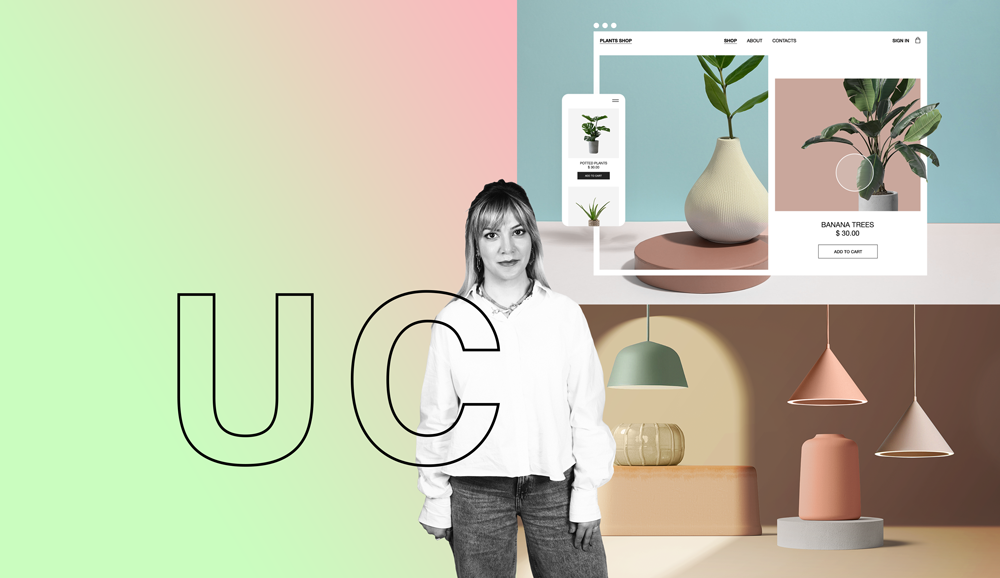
Gayka | Graphic Designer
2. Marie Kondo praises minimalism. She says we should all keep only those things that speak to the heart and discard items that no longer spark joy. How much minimalism can we inject into web design without showing too little?
NANA: I agree entirely with Mari Kondo; I am a fan of minimalism myself; in fact, any type of style or design looks more elegant when it focuses on simplicity.
What goes for minimalism in web design? We can apply it as much as we want. It makes websites more accessible for the users, as well as more appealing to the eye. But minimalism should be applied very intelligently: the fewer the details, the more challenges a designer has in creating a stunning, functional website.
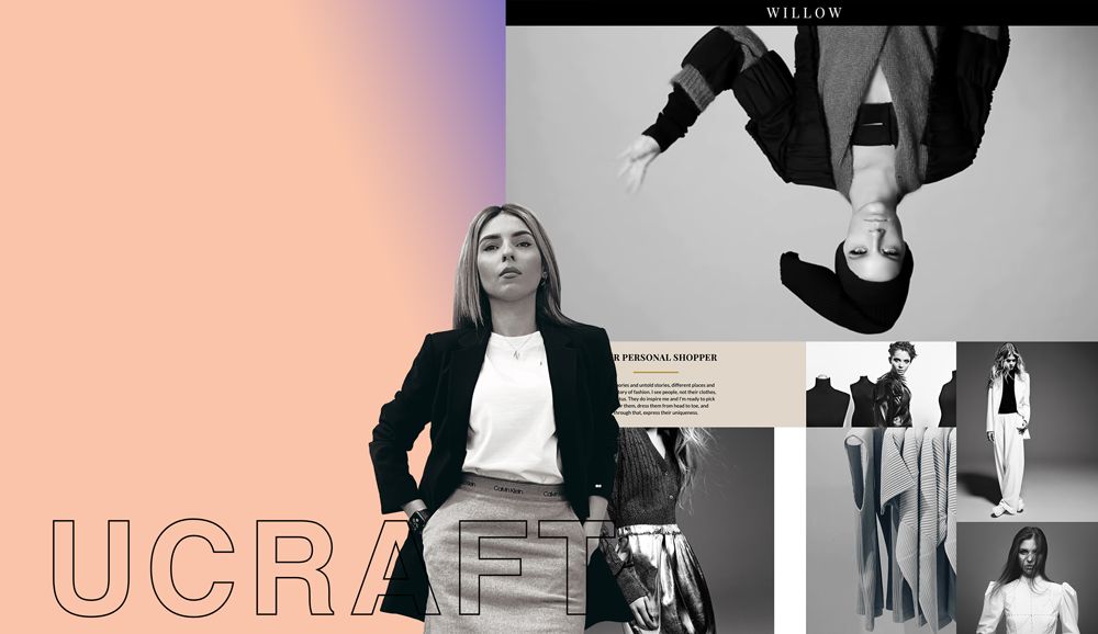
Nana | Senior Web Designer
3. What are the basic principles of web design you could never abandon, and what are those you could live without?
GAYKA: Many designers follow the principles and rules of building a user-friendly interface at the level of intuition, without understanding these elements and design principles; however, to create something outstanding, it is better to adhere to several principles:
Objective
Each page on your website should have a clear objective to meet the specific needs of your website users as effectively as possible.
Typography
Typography plays an essential role in your site; it must be legible. You should use no more than three fonts to keep the content clear and understandable.
Color Palette
The color palette not only provides the look and feel of your site but can also affect traffic and user actions. It is better to use no more than five colors.
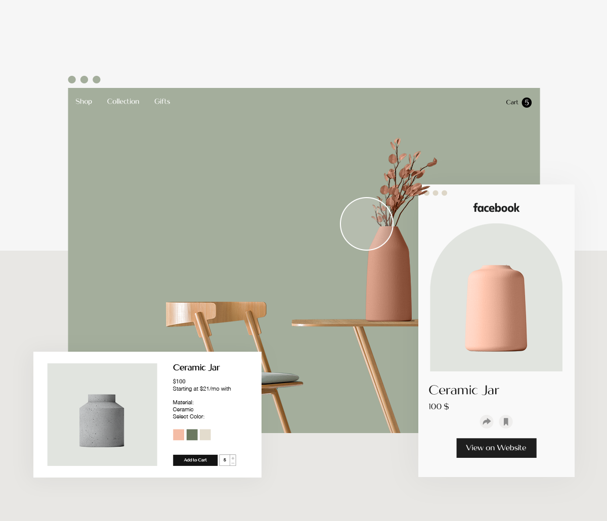
Visuals
One of the most critical parts of a website is choosing the right images, including illustrations, videos, animations, and all kinds of graphics.
Balance
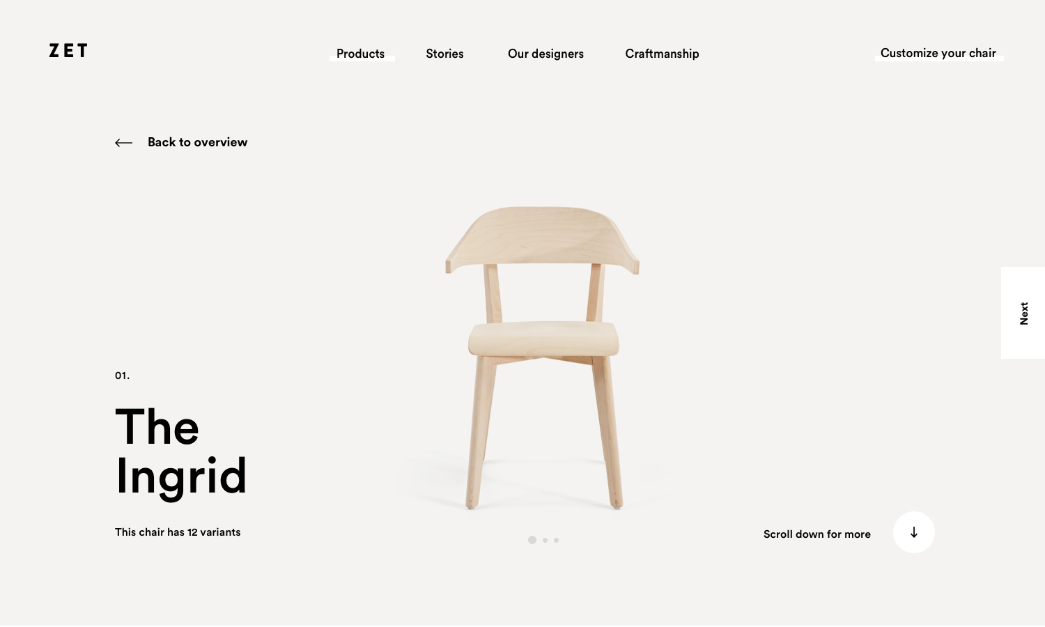
Distributing design elements such as shapes, text boxes, and images evenly across a structured layout provides balance. Every design element has a visual weight. There are design elements that have a certain heaviness to them, while others, on the contrary, are light on the look.
Balance does not imply that elements must always be evenly distributed; balance can be symmetrical or asymmetrical.
I start every new project with the principle of balance, and as a rule, asymmetric balance attracts my attention much more. In asymmetrical balance, the elements are not centralized in the overall design, which gives its flavor.
4. What is the first question you ask someone who wants to build a new website from scratch? What other designer questions do you think are essential to know the answer to before you start working on a new website?
NANA: First, I try to understand what preferences the client has and what is unacceptable for them. Then, I’ll combine that with what I find correct and appropriate. Naturally, a designer should try to collaborate with the client on all stages of the project. However, a designer should remain a designer, not a passive doer.
5. Name some web design elements that make you want to spend time on a website you discovered. Also, describe some website elements that make you close that tab at the speed of light, never to return.
SONA: UX is always the most important for me - on a website, you should always be able to find what you need without putting in too much effort. As a designer, I also prefer to go through a pleasant aesthetic experience as I navigate a website.
Likewise, bad UX will make me leave the site as fast as possible. Websites are supposed to take you by the hand and guide you to where you want to go.
Sometimes people turn to such layout changes that go against any written or unwritten rules. I personally believe that no one needs to reinvent a bicycle. Some things have been created as a result of years of practice to facilitate our virtual life.
And of course, I’ll quickly run away from a site with bad design, ugly fonts, and colors (to quote Phoebe from Friends: “Oh, my eyes, my eyes!”)
Sona | Art Director
6. What are the main rules in web design that you are guided by?
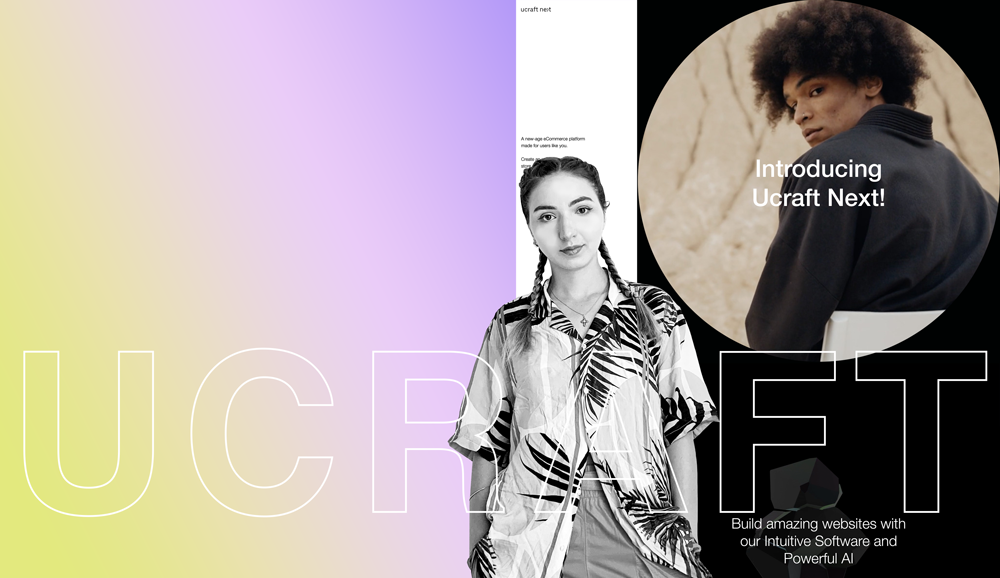
GAYKA: As I start my project, I follow specific design rules: hierarchy, balance, the correct combinations of colors, fonts, etc. But sometimes, I want to experiment, go against the movement, use asymmetric layouts, distortions, layering.
It feels like a way of protesting against the traditional standards of "good" design. This is how the Anti-Design trend has emerged. This type of design is not suitable for every project, but it can be helpful to customers who want to stand out.
The anti-design trend is entrenched not only in the world of graphic and web design but also in the fashion and product design industry. This is a natural and radical reaction to being bombarded with traditional aesthetics - regardless of the industry.
7. Coding or no coding in web design? Where do we go from here?
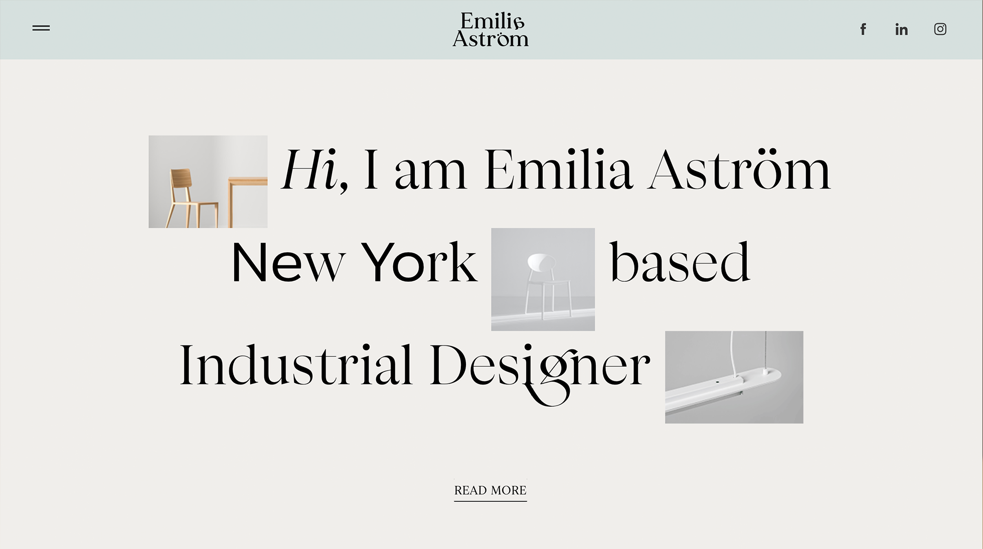
SONA: Although this worries me a little bit, it is evident that many processes are becoming automated. Thus, I cannot exclude that one day there will be no coding at all. Everything in life is moving towards simplification. I believe website builders have done pretty well in this sense so far - they relieve people from both design and coding stages.
Before we leave, instead of conclusions, tell us in a few words what makes a good website in 2021 from your perspective.
NANA: Currently, effects, professional photos, and typography take a significant share. These three will make your site trendy and cool.
GAYKA: I will say this: go where you want and not where you are expected. Do not accept the standard version. Do not be afraid to experiment with different fonts or colors, but simultaneously remember the competent construction of a website and your customer’s requirements.
SONA: It probably is ALL IN ONE; when all is done correctly, your website becomes eternal, not only for 2021. Trends will come and go, but people never stop using the iconic almost centennial Helvetica.
Thinking of creating your own website but stuck on design? Check out our professional Ucraft Template Collection, inspired by timeless design and exceptional UI/UX standards. Regardless of the nature of your project, you will find the template you need in our vast collection, crafted with love by our talented design team. Good luck!

