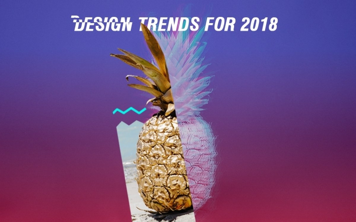
If you look around with your eyes wide open you’ll see changes everywhere. As December makes a change into January, most of us decide it’s time to make adjustments to our lives. And it doesn’t matter how much we try to be ourselves, usually, at the end, we start following new trends. As the cliche goes, we make new year resolutions: “new year, new me.” For designers it goes like, “new year, new design trends.” On that note, web and graphic design changes follow us as we go. Remember how popular flat design was in 2016? And then materialistic conquered the world of design by its system for uniting style, branding, interaction and motion.
Here at Ucraft, we have some of the best designers that can motivate you to create something extraordinary. They put their hearts and minds into the work they do and make you fall in love. In fact, if you are searching for design trends to use in 2018, our “creative minds” have some tips for you. Ranging from hand-drawn illustrations and duotone to brutalism and creative typography, I’m sure you’ll find a good portion of inspiration.
That Horror-like Glitch Effect
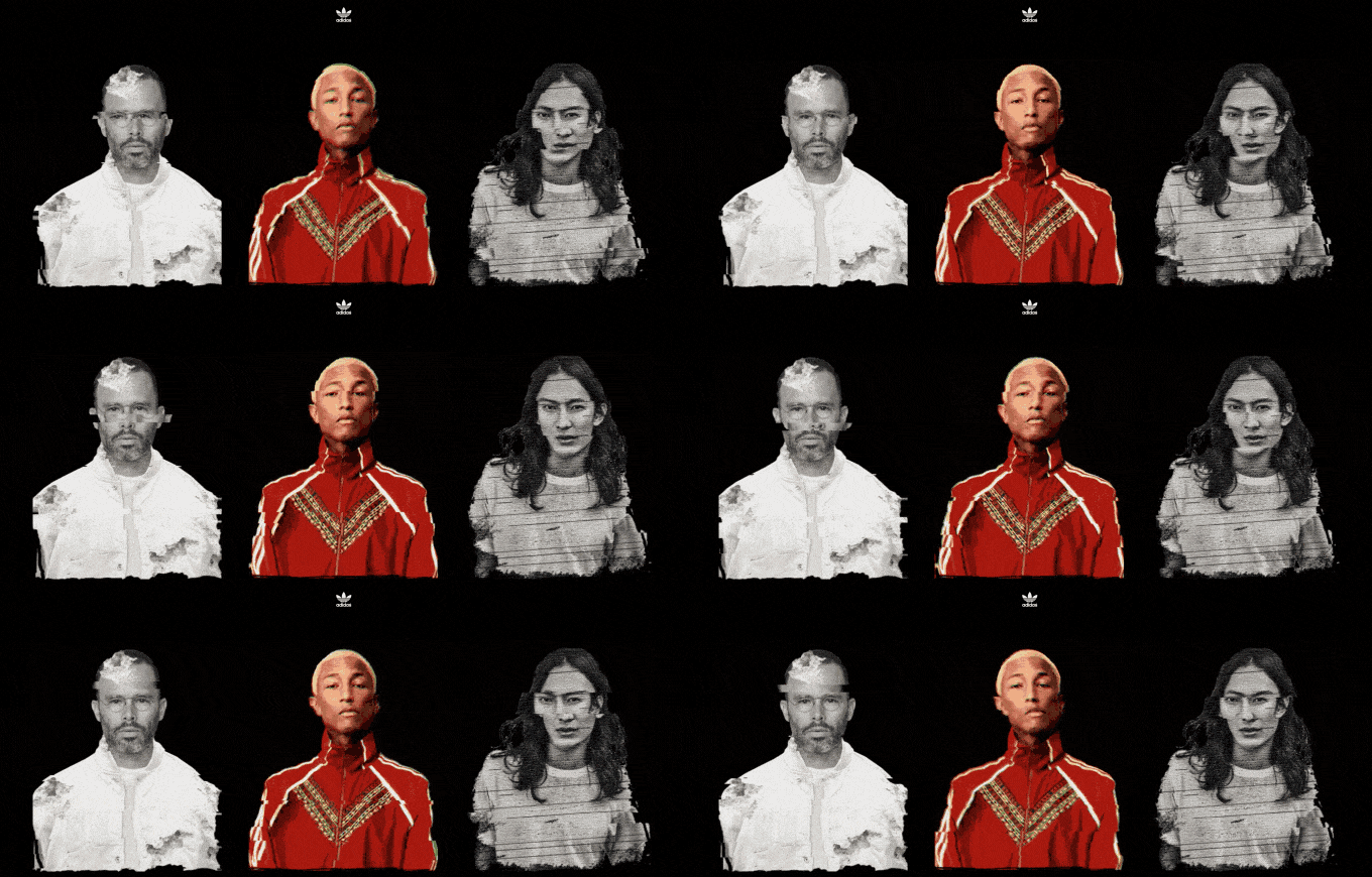
The glitch effect, or else the corrupted image, has swept us off our feet and became one of the most popular trends of 2018. Originally, glitch art is the practice of using digital or analog errors for aesthetic purposes. Glitches appear almost everywhere: in visual arts if you can recall the movie “A Colour Box,” in video sculptures like TV Magnet (1965) by Nam June Paik and more. And if once this was annoying for the viewer thinking that there was an error behind, now this turned into a strongly wanted effect. I’d say 2018 get ready! These corrupted images are going to take over the graphic design world.
And just like that, our light like a butterfly and strong like a lion designer Nana, incorporated the trend of glitch effect in one of our landing page templates: Adidas. Inspired by great artists like Daniel Arsham, Pharrell Williams and Alexander Wang, she was able to create a real work of art.
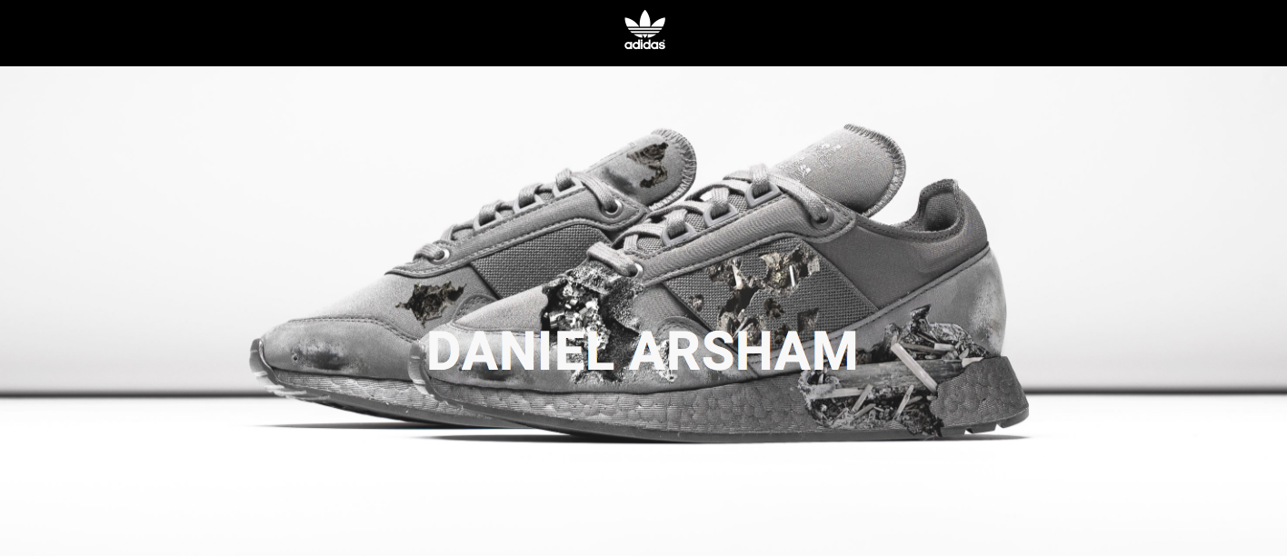
“Using the glitch effect in web design is a tricky thing to do: it’s not a picture and it’s not a video. But somehow it creates a force that moves the viewer.” Let’s concentrate on Daniel Arsham’s work for a second. “As Arsham’s multidisciplinary art combines art, architecture and performance, I wasn’t afraid to mix his works as an architect with his works as a designer and created this illustration of his sneakers,” this is something Nana wanted to point out. “Always know your limits when experimenting with different kinds of art.”
Double Exposure Duotone
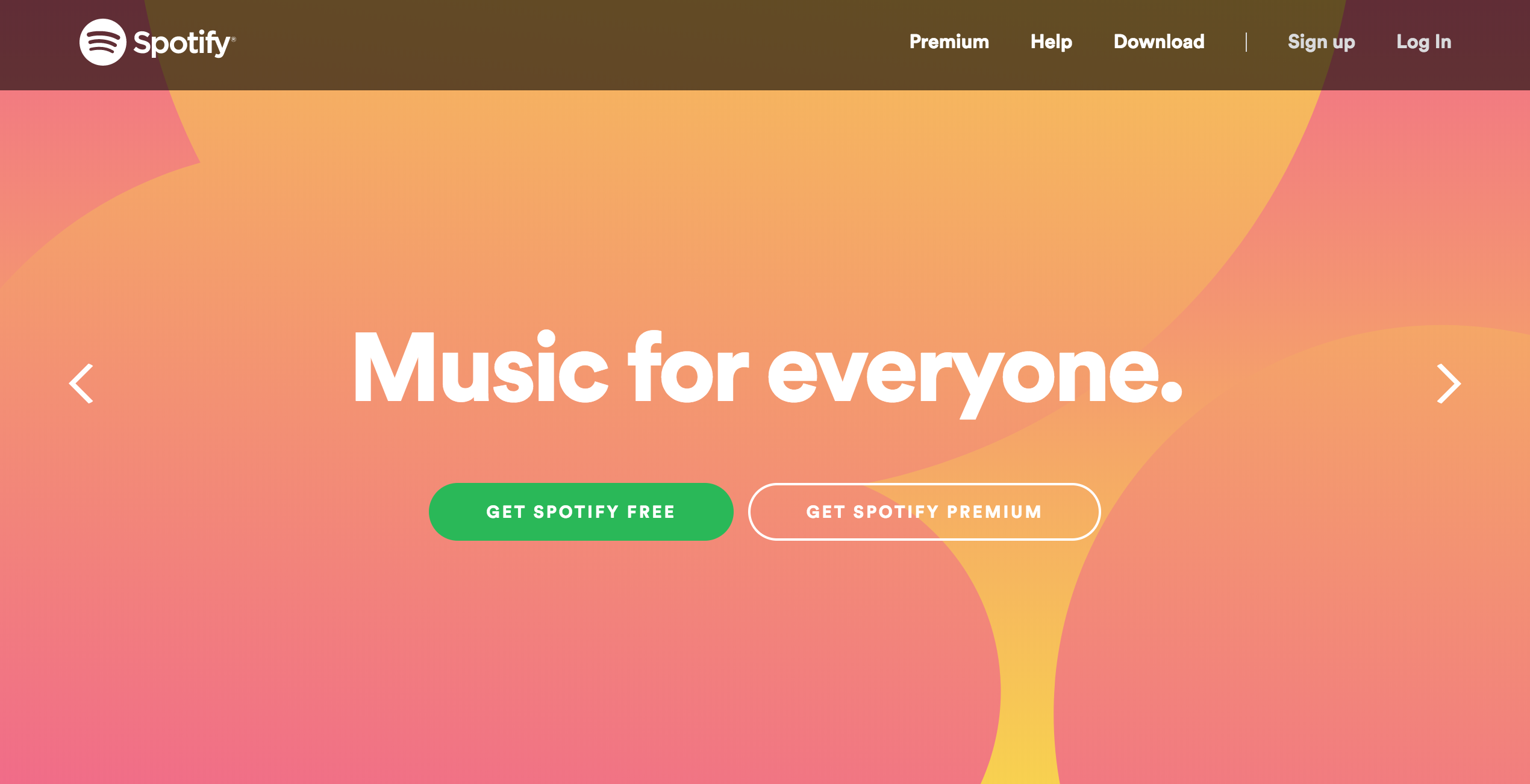
The fancy design trend of double exposure duotone came into our lives and took our breaths away. It is achieved by doubling the image, or in other ways, using two different overlapping images in monochrome colors. One might say that it creates an “ahead-of-its-time” effect. Duotones are expected to be among the top design trends of 2018 with their bold colors and magnificent application possibilities. Remember how Spotify made a return to the mainstream design with the help of duotone images both in their app and promotional microsites?
Play Around With Typography
Typography has a big importance in graphic design. In 2018 you’ll find that the bigger and bolder, the better. With that in mind, our cutest designer Gaya created Ucraft’s Dude template. Besides, designers will also go for more artistic typography. In fact, you should be ready to see more typeface variety: more decorative, handmade and serif fonts. Gaya, says:
“You can express your thoughts visually with your creative typography. The visualization of letters gives you a huge space for creativity. In fact, the more creative your typography gets, the more user attractive your design becomes. And we always strive for our audience’s attention, right?”
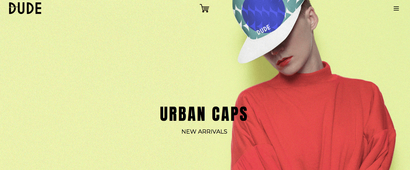
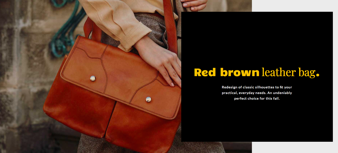
So for 2018, keep in mind to get extra creative with your typography. But can your creative typography work by itself? What about the images? Our attentive designer Sona loves a quote by David Stuart, that goes like, “ Designers tend to whisper, ad agencies tend to shout.” If she had to give you one piece of advice about design for 2018, it would be to have your typography and images working in harmony. Moreover, thanks to web font providers like Typekit, Google fonts, and many more, we’re able to deliver pretty looking fonts and handcrafted typography with no hassle. If you check out Sona’s Kashve e-commerce template you’ll know what I mean. At the end, she adds:
“Hope you like my whisper.”
Gradients (color transitions)
As you already know, flat design is evolving. And on that road, gradients are making their big return. The development of gradients, or as one might refer to, color transitions, is part of a design innovation called the “flat 2.0.” They appeared on iOS, Stripe, and Instagram and set their popularity straight. Moreover, you’ve been seeing more deep and semi-flat design lately and you’ll see even more in 2018.
Illustrations
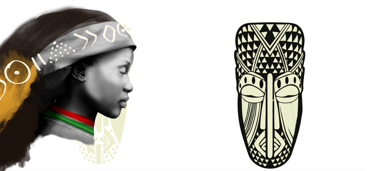
One might say that illustrations can never go out of style. And there is a reason behind: custom hand-drawn illustrations are like pieces of art with lots of talent and imagination put in them. A new trend for 2018 is mixing photos with digital drawing: illustrations over photos. In fact, this year you’ll also come across illustrations combined with other graphic design trends: negative space, 3d structures, double duotone, etc. The new trend is amazing especially because it lets designers get as creative as they want. And they’ll be able to add personality to the brand with their design.
Emma, our brightest designer, used the new trend of illustrations over photos in her Tribal template. She was particularly inspired by Jimmy Nelson’s photography. Emma’s advice for being an awesome designer in 2018 is:
“Always look for inspiration. I found the true source of enlightenment and motivation in Mario Testino and Lee Jeffries’s works.” And if you’re not that into art, you can get inspiration from awesome websites like Awwwards, Medium, Pinterest, Unsplash and more.
Movement: animations & GIFs
All the eye catchy moving stuff will be very relevant this year. Our dynamic animator Emin thinks:
“It is especially important to pay a lot of attention to microinteractions when creating animations or gifs in 2018. Simply put, micro interactions are tiny animations that have the mission of communicating with users and helping them perform their tasks. This UX best practice will not only keep the viewer interested but will also take your design to the next level. It’s guaranteed that you won’t bore your viewer with your slick animations.”
And when you catch yourself staring at your screen with an empty mind and no design ideas, we’d suggest checking out websites like Dribbble and Behance. Moving on to GIFs and SVGs: they take the gold when it comes to communicating your ideas to your audience. With their extremely appealing essence, GIF logos have become a trend of their own.
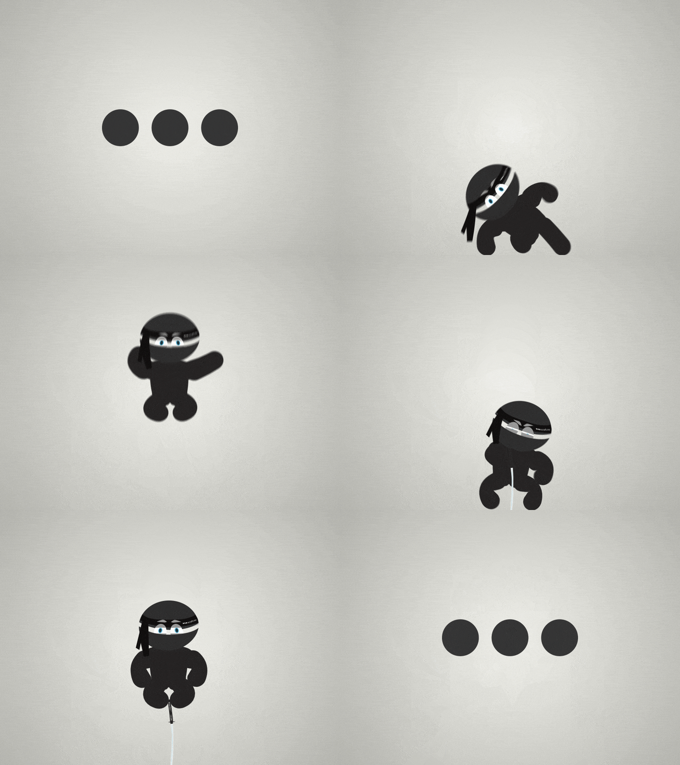
You know what else is appealing? Cinemagraph! And it’s here for you in 2018. Cinemagraph is essentially a still photo with a repeating video loop for only a selection of the picture. Imagine a picture of a cup on a table, with the hot coffee smoke dancing in the air: the striking contrast of movement on extreme stillness can totally blow your viewer’s mind.
Who is it for?
It’s important to keep in mind your target audience when creating a design. If you’re coming up with a design that is mainly for Millennials who spend most of their time on social media, goofy animations, and bright color transitions would work for them better than for Baby Boomers: you might need a more settle and professional approach when creating something for them. Our perfectionist UI/UX designer Hovo says,
“Every piece of your design has to have a purpose and meaning behind. It’s easy to get lost during the creative process and end up crafting a design that expresses yourself. And it’s crucial not to get caught up in the moment and forget about your audience.”
Moreover, there are questions you need to ask yourself before coming up with a design. Who is the design for? What do you want to say with your creation? What do you want to achieve? So next time you’re designing a beautiful piece put yourself in your viewer’s shoes and understand their hidden needs and wants.
Authenticity
What separates great creators and designers from the rest is never the fact that they follow trends, right? It’s their ability to be authentic and stay true to who they are no matter what the world tells them to be. Mher, our brilliant Art Director, gives you one piece of advice that is crucial in every aspect of your life:
“Don’t feel obligated to follow any trends, be authentic. Whatever you have inside is always different, always unique and always attractive.”
Design trends are constantly evolving. So a great takeaway from this article should be to seek new creative tactics all the time and keep in mind to be authentic with whatever you create. And if you want something trendy and timeless at the same time, you can check out Ucraft's creative templates.
> Get Started With Ucraft

