They say, "having a website is crucial for the growth of your business." Or else, they go on with, "who doesn’t have a website for their business these days," "how do your customers find you online?" and "do you still have any sales?"
Yes, we get it: you got to have that small business website of yours. But one thing that people forget to mention is that a site online with your business name on it is not enough. In fact, it’s far away from enough. There are very important features that your website must have. And those are just the basics, the very minimum your audience demands.
Did you know, that it takes approximately 0.05 seconds for your users to form their opinion about your website. And that’s when they decide to stay or leave your site. Pretty tough. After all, there are millions of great websites they can rather visit.
And let’s not forget about the competition: there are hungry wolves out there, grabbing every piece of attention there is.
So, let’s get to it.
#1 Navigation at the top: roadmap for your users
It’s like a roadmap for your users to easily find whatever they’re looking for. Imagine going to Walmart, one of those huge ones, and trying to find milk. Those signs hanging from the ceiling, they help you find the aisle you’re looking for, right? Imagine if those were not there? You’d be lost, confused and in about 6 minutes would drop everything and leave. After all, there’s so much time one can spend trying to find milk.
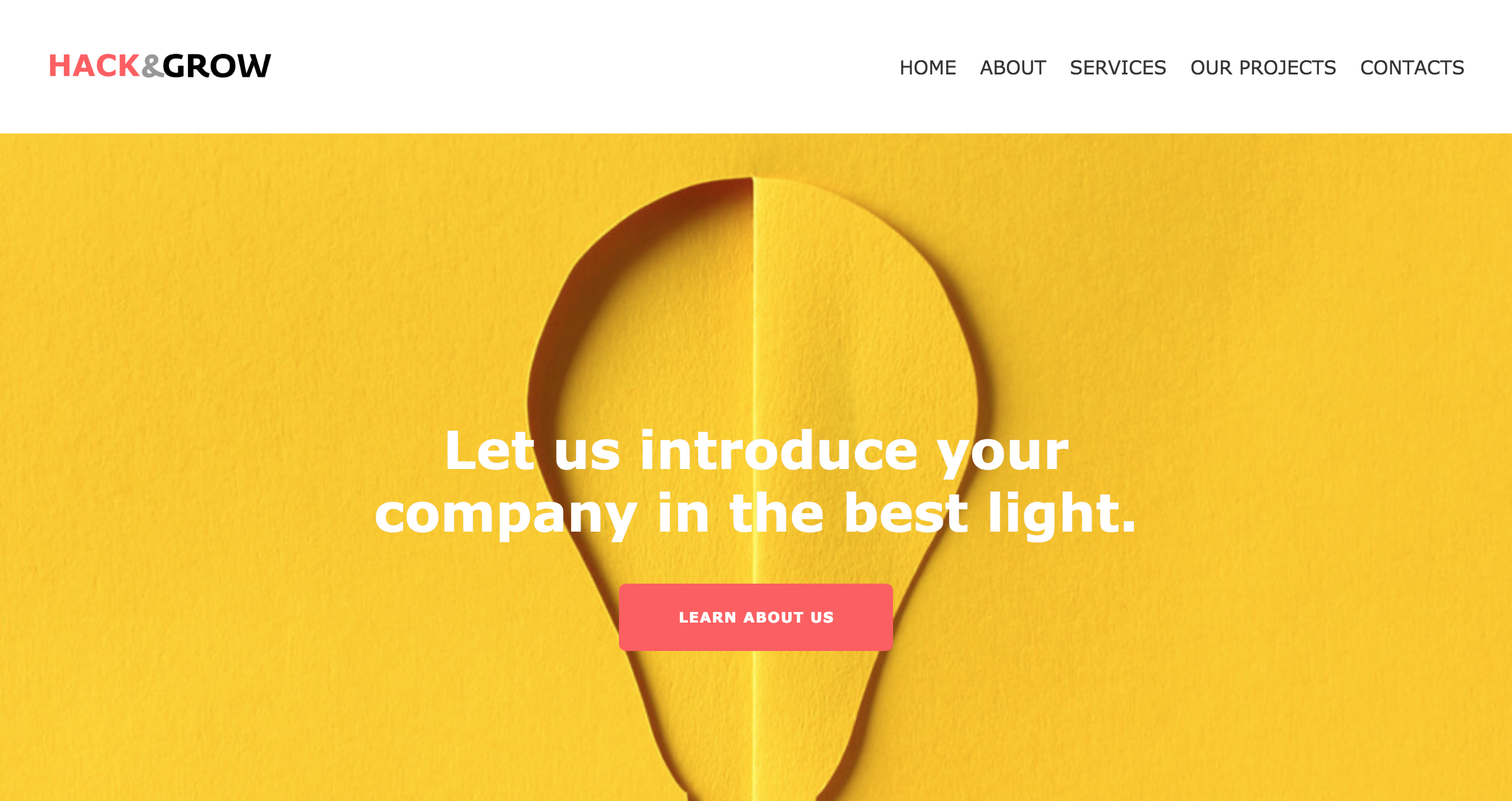
Just like that, having navigation at the top of your website is what guides them throughout their visit on your website. Without it, they might not care enough to browse through the whole site and find, let’s say, your “about us” page. Here’s a perfect example of a perfect navigation at the top from our HACK&GROW template. Black on white, easy to notice!
#2 Logo: got to identify you somehow
Take your company logo as your the face of your brand. I know it might sound a bit odd, but your face is what people identify you with from the first glance, right? Just like that, your company logo is one of the most important identifiers of your brand. But you already know that.
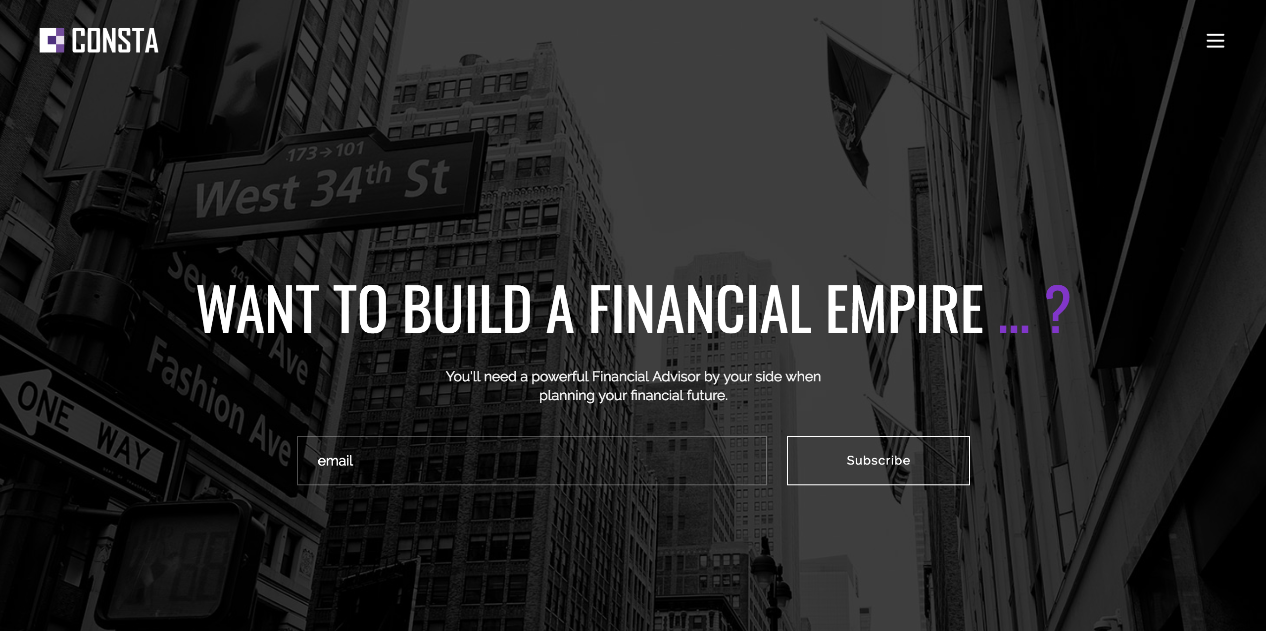
What I’m trying to say, is that your small business website has to have your logo at the top of the page, somewhere visible, so when your clients visit your site, they immediately know where they are. Take our template Consta as an example: you can find its logo in the left corner. By the way, you can create your logo with an online logo maker for free with a little push on your imagination.
#3 Clear messaging: what is this? who are you?
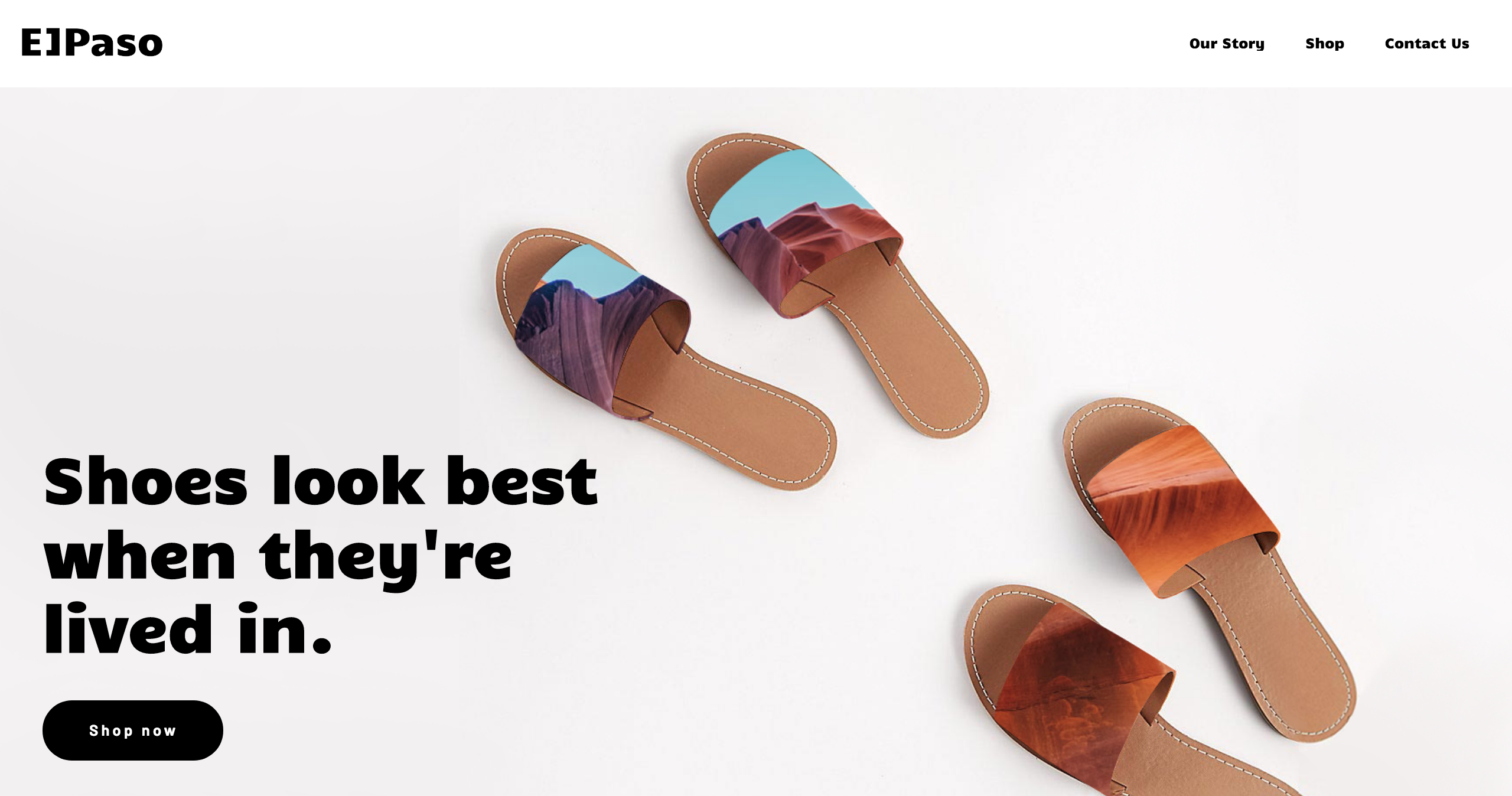
Those questions just listed will pop up in your website visitors’ minds after about 10 seconds if not sooner. For them not to go to your “about us” page and read about your company, you can have a text that says it all about your brand. Our ELPaso template is the best example here: shoes look best when they’re lived in. And after reading this, you immediately have a clue about the company. With a clean messaging you will not only grab your clients’ attention, but also help them figure out if you’re right for them. And if you are, they’re already hooked!
#4 Visuals: people want to admire
Ever stopped to think about how little your users really read? You gather this great content marketing team, share your company vision with them, produce unique and high-quality content, and assume every single visitor reads it all. But like many things in life, it’s only in your head. Jakob Nielsen, who is a usability expert, says that the average user only reads about 20%-28% of words during their average visit. And that’s about 80% of people who only go over the content they read online with a glance.
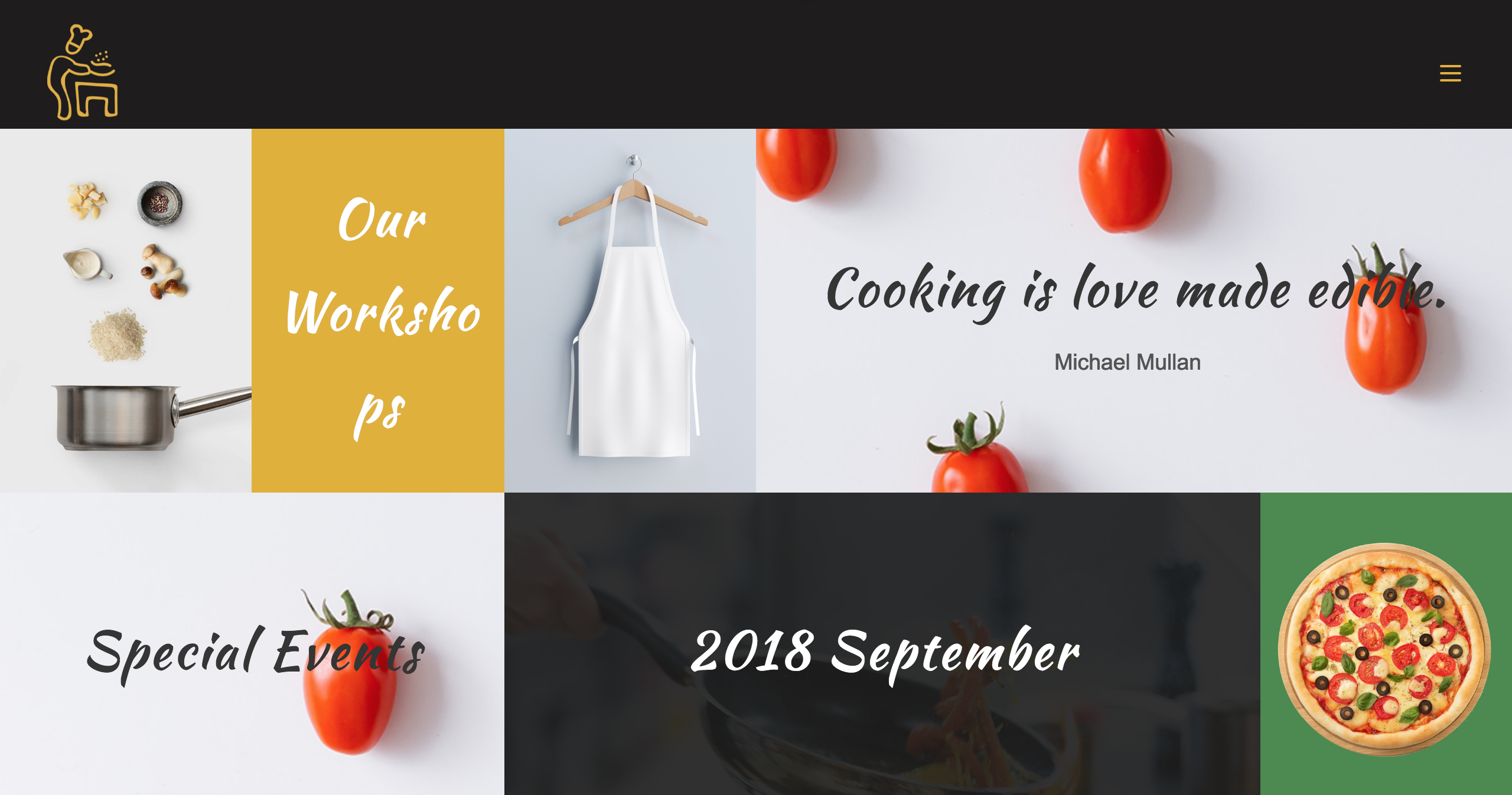
So, what is this information taking us? Visuals: they are super important on your website. People look at your homepage for a second with hot coffee in one hand and a phone in the other, thinking about a million things. Your text is not what’s going to attract them. But your visuals just might. How about the template below? If you’re hungry as hell, wouldn’t this get your attention? Create something people can’t stop looking at.
#5 Blog: this is how you get traffic!
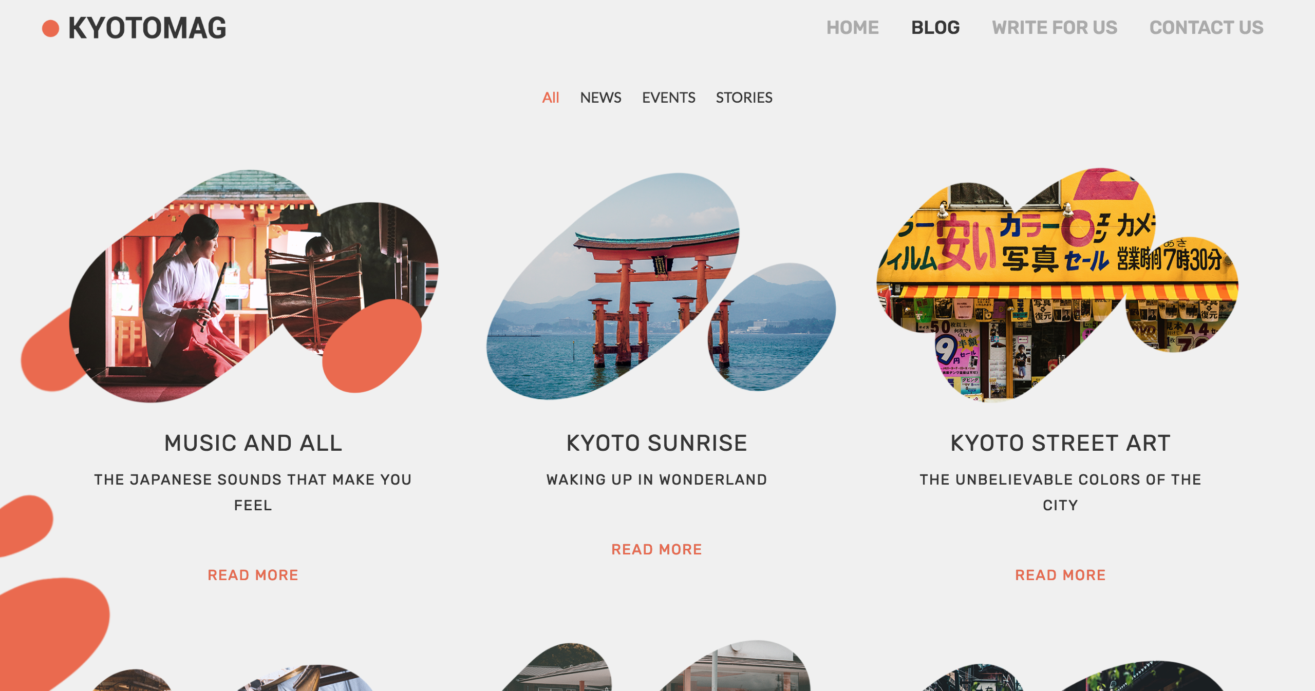
I get these questions on Quora about twice a day: how do I get website traffic? Of course, you got to optimize your website, be visible on search engines and aim for higher rankings. But one great way of getting that traffic is by having a great blog. When I have a question, I type it in Google and go through about 6 blog posts to find my answer. The same way, when you write insightful articles related to your industry, people interested in your company will find their way to your website. Besides, there’s not much people can do on a website, but where there is an insightful blog, far more intrigued and interested readers are guaranteed to drop by. Take a look at our template KyotoMag: not only it will bring the needed traffic, but it sure as hell looks stunning.
#6 CTA buttons: make them move
There are these people, beautiful people, you only want to look at. You don’t need to engage with them, talk to them, become their friend. You simple like to look at them. And there are websites like those: great design, breathtaking visuals, creative content, etc. But somehow, visitors don’t engage with them.
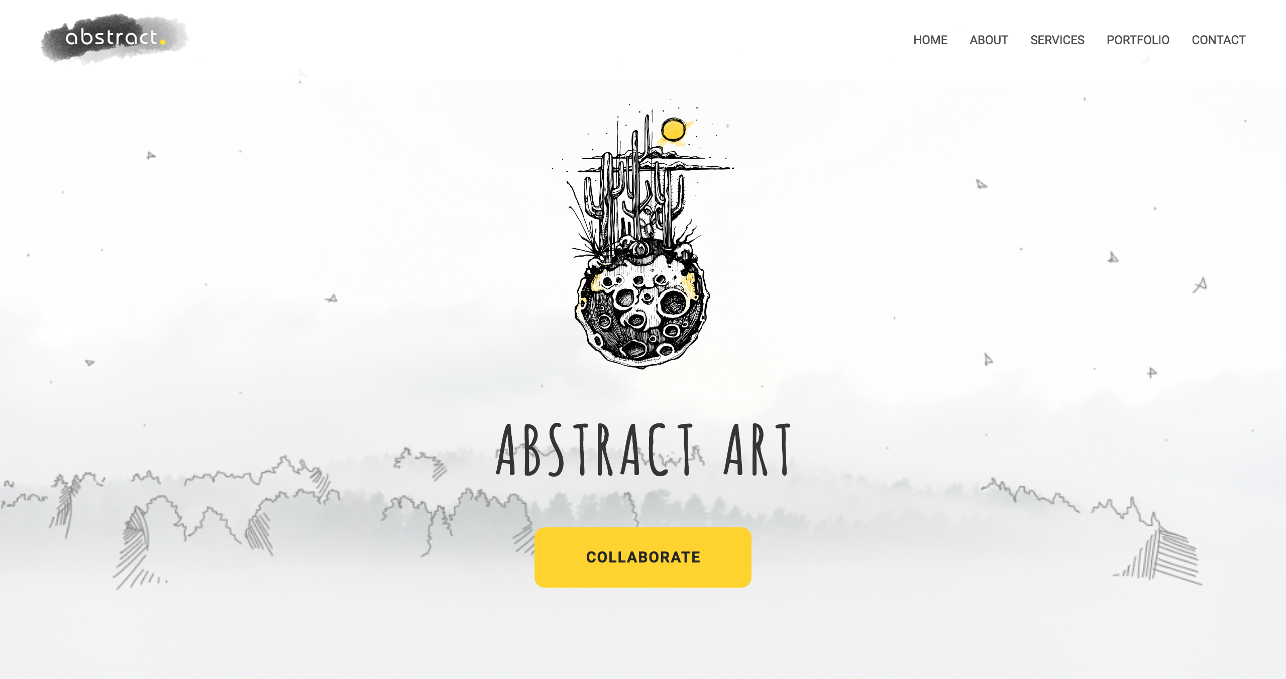
Usually, the problem arises when there are no call to action buttons on the website. That’s the biggest mistake you can make, I assume. So make sure to have those CTA buttons that take your user to the next step on your sales funnel. Whether it’s for them to subscribe to your newsletter, shop online, follow you on social media or anything else, give your users that button so they can move forward with you. See the yellow button that says collaborate? Check it out closer in our Abstract template! That’s a great CTA button you can’t miss.
#7 Testimonial and reviews: can we even trust you?
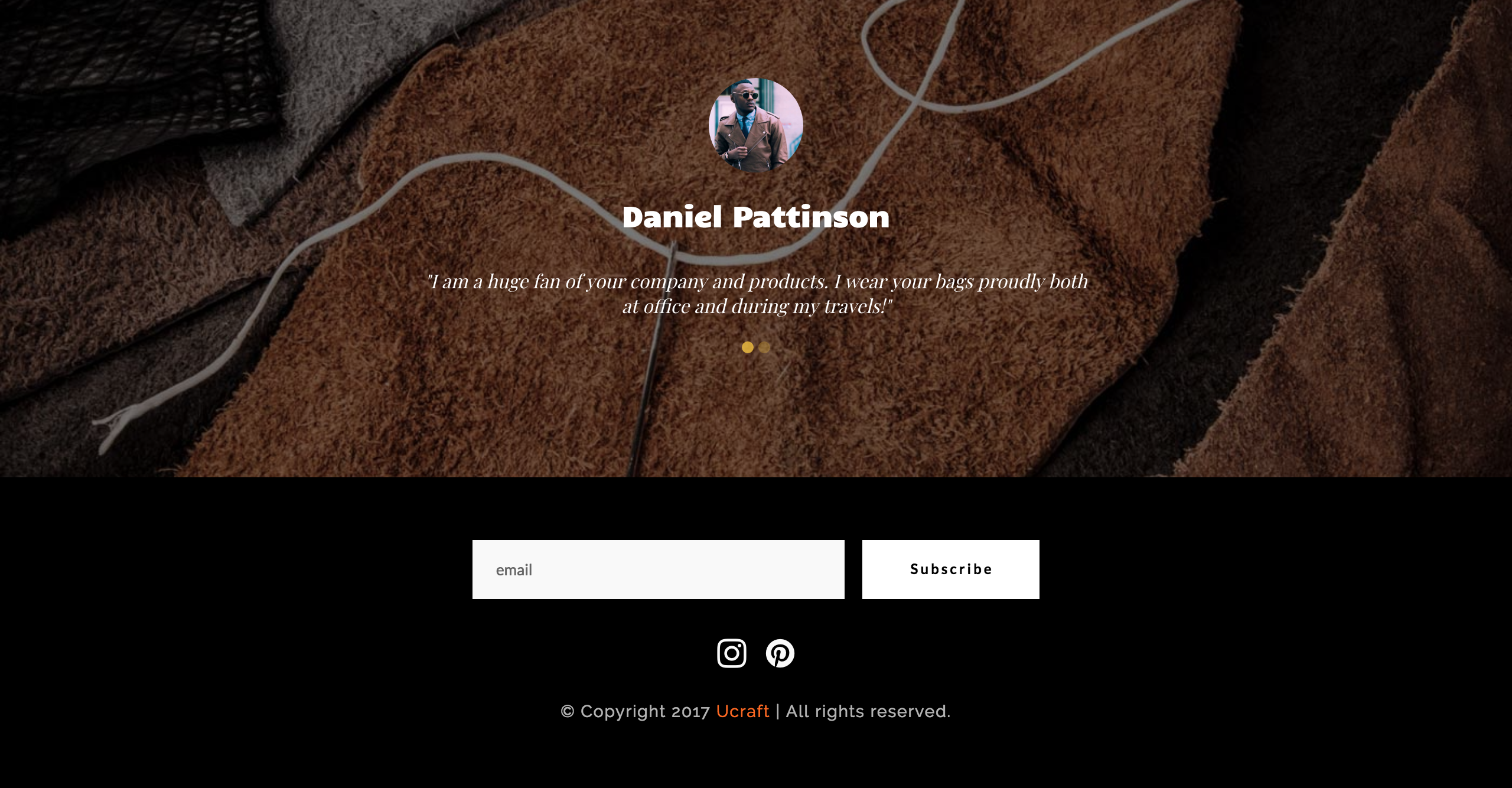
They say, it doesn’t matter what kinds of advertisements you make and how hard you work on your marketing strategies, clients tend to trust and believe other clients more. So, having a “testimonials and reviews” section on your website will have its perks. You will seem more trustworthy and in a matter of time, your customers will grow and your sales will go up. And there’s nothing more we can add: simply take a look at the testimonials in our Kashve template and add yours.
#8 Social media icons and share buttons: connect them all!
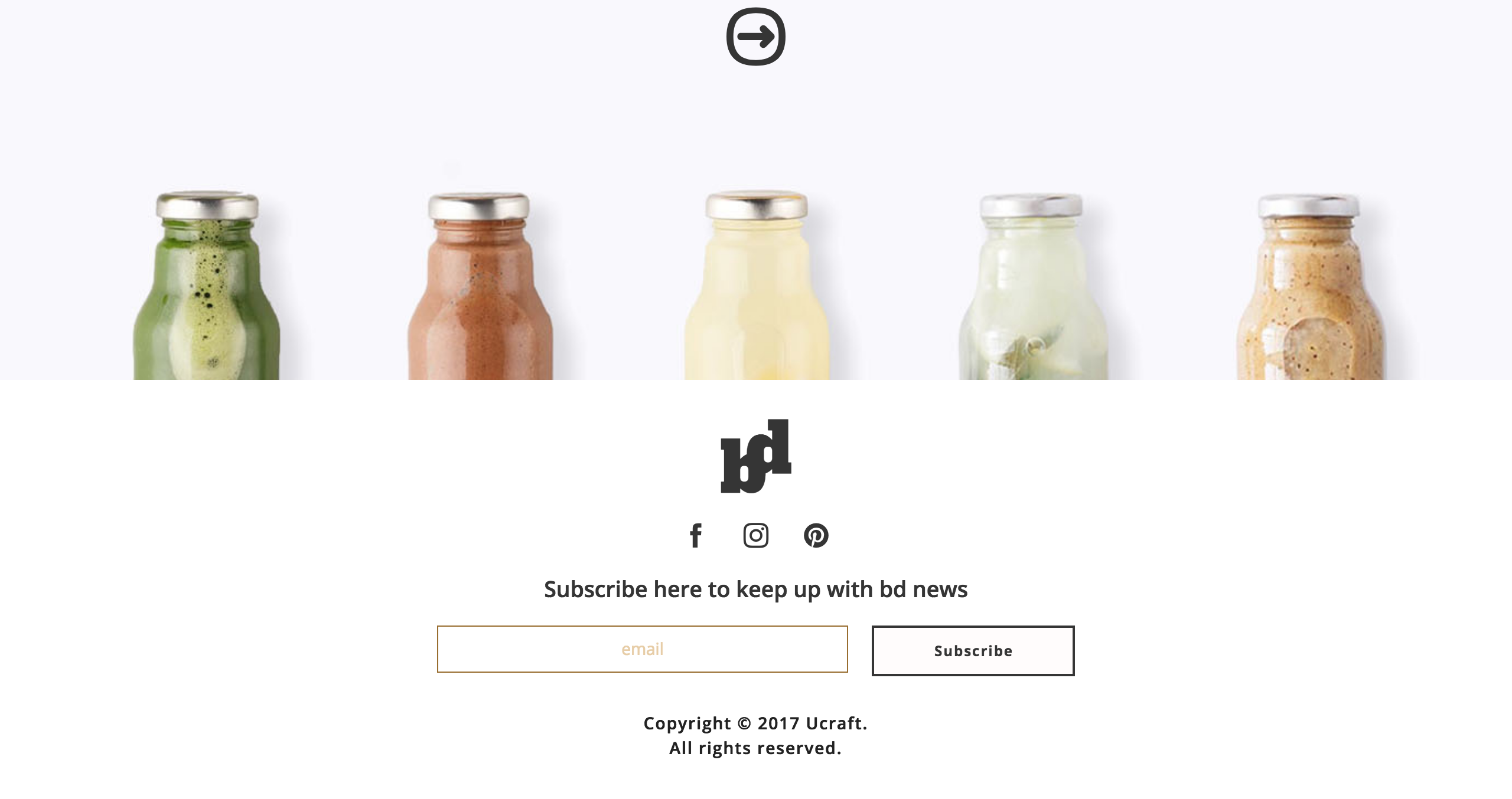
Let’s say you got that website traffic you wanted so badly. What’s next? How do you want to keep in touch with your visitors? How do you want to engage them more and, hopefully, turn them into loyal customers? A great way is to connect with them on social media. Whether you’re active on Facebook, Instagram, Twitter, Pinterest or all the places together, give your users a way of finding you online.
So, there are those social media icons. Usually, you’ll have them in the footer of your website. And then, those users who’ll follow you on your social media channels will see your constant posts, will engage with you and will stay up-to-date with your company’s advancements and news. See those buttons on our Bio Drink template?
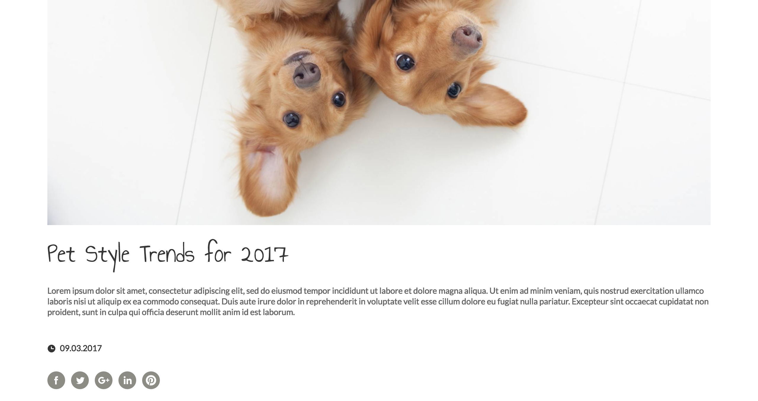
And then, there are the share buttons. After reading your insightful blog post, inspired users will be able to share the article on their social media channels. A great way to spread the word, right?
#9 Subscription: send those perky newsletters
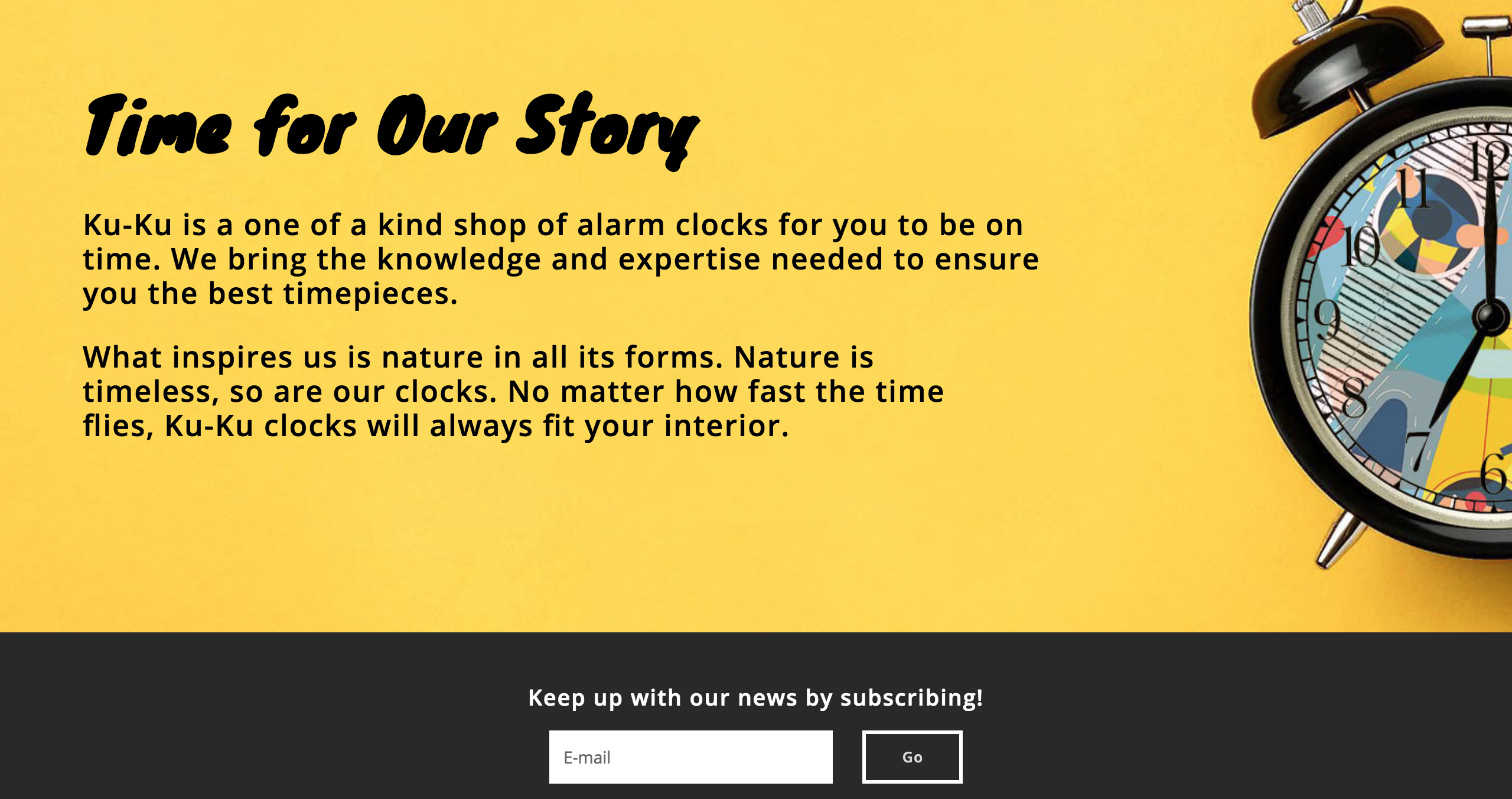
And of course, there come the newsletters. When you have discounts, giveaways or cool new features, or when you simply want to say thanks to your loyal ones, you send those perky newsletters to attract or keep your customers. In fact, newsletters are a strong marketing tool that we use to maintain contact with our customers. But how do you collect their emails? Got to have that subscription element on your website, preferably in the footer. Take a look at the subscription box in the Ku-Ku template. The ones interested in your company will easily write their emails there!
#10 FAQ: put yourself in your customers’ shoes
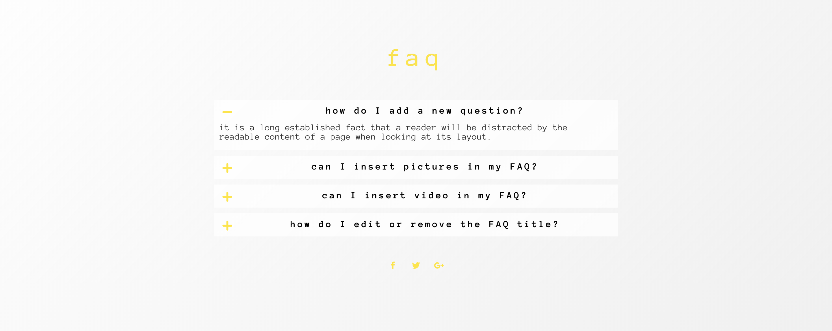
Want to make your small business website helpful and welcoming? Got to have an FAQ section. In order to write it, you can gather all the questions you usually get from your users and have them all nicely answered in your FAQ page. Another way, especially if you’re just starting out and still don’t know what questions they might have, is to put yourself in your customers’ shoes and answer the questions that they might have. Use the accordion element when creating the page, it’s like a little game. Here's an example from our Olala template.
#11 Contact: they got to get in touch with you somehow
As one step always takes to the other, let’s move forward to the last. Your small business website users will definitely feel the need of getting in touch with you at least once. After all, they might have questions you didn’t answer in your FAQ. So it’s of crucial importance for you to have all your contact information they might need.
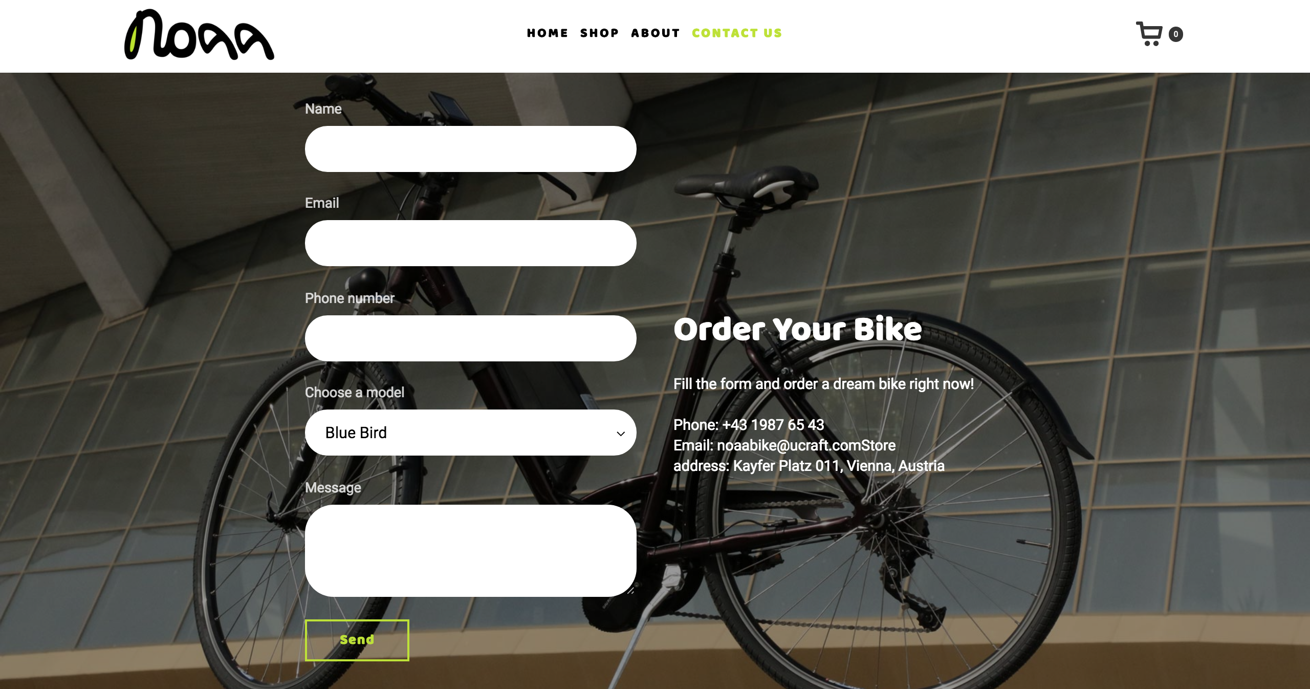
So having your business email up there in the “contact us” page is one way. Another way is to have a contact form, which your customers can fill in. Your business phone number could also go up there, in case someone is in a hurry. See how everything fits in perfectly in the Noaa template?
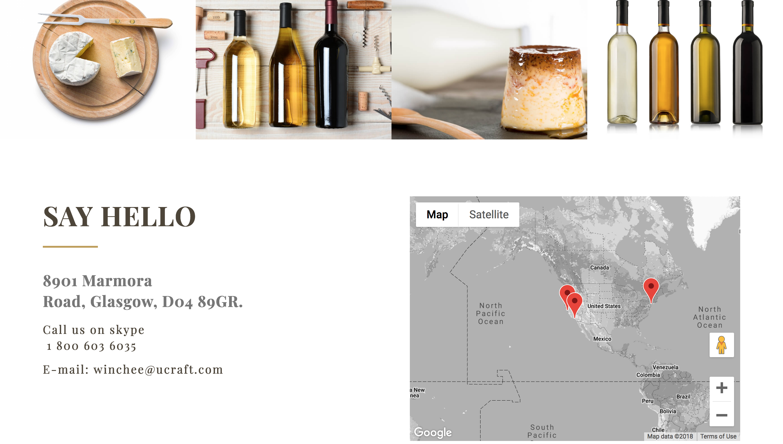
In case you have a physical shop, office or a place where people can find you, you should definitely have the map element in your “contact us” page. In fact, if you have more than one address, you can put multiple points on the map. See?
Lots to soak in, isn't it? And these are not the only features: there are many more that you can use to make your website more interactive. If you're a small business owner or just getting started on your online shop, these templates will surely give you an idea of what your website should look like and what features it must have.
For starters, follow the button below to move forward.
> Create a Business Website

