Try out Ucraft Next, our newest eCommerce solution. Get the first 14 days for free. Sign up now!
How to Create a Landing Page
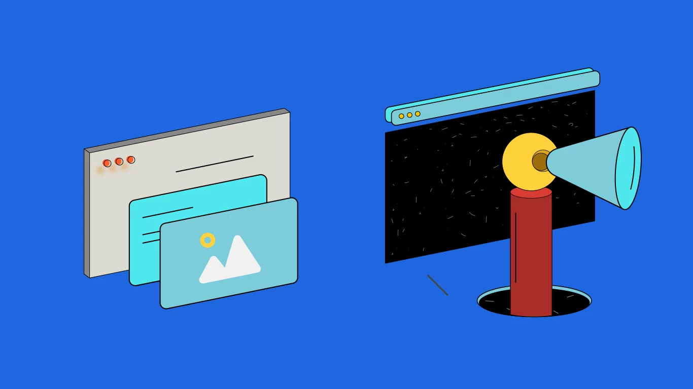
Now, you might not know the exact definition of a landing page, but you have definitely come across one before. A landing page is a single web page, created specifically for marketing and advertising purposes. It is the first page you “land” on when you click on a link, and usually focuses on a single goal - to convert visitors and make them respond to your CTA (call to action). In comparison, website pages usually have more than one goal, and are not designed to convert traffic from a specific marketing campaign.
To put the definition into context, consider a Telecommunications company that has just released a new payment package for mobile phones. It would be a good idea to create a standalone web page focused purely on encouraging people to buy the package. The page will have:
A single focus - the package

A single motive - to encourage people to make a purchase/sign up
A CTA - something like “try now”
Landing pages can be used for various purposes, depending on your end goal. Think about it this way - if you want to achieve a single goal and convert users, a landing page will be your best friend. For perspective, these are some of the reasons why a marketer will create a landing page:
- To sell a single product/service
- Obtain leads by asking visitors to submit a form
- Ask visitors to reach out to an organization
- Encourage visitors to subscribe to something (e.g. blog, email list)
- Get people to register for an event
- Encourage donations for a specific cause
Now, you may be wondering why landing pages are so common and - more importantly - so crucial for various campaigns. After all, marketers can just include their campaign on their main website, or engage in SMM, right?
The fact of the matter is that landing pages are much better at increasing your conversion rates (the percentage of users who take the desired action) and lowering your cost-per-acquisition (the average cost to acquire one paying customer from a campaign).
A website homepage is usually over-saturated with information and various links, preventing the visitor from focusing on a specific offer. Not that it’s necessarily a bad thing, since a homepage is required to introduce the company, communicate corporate values and present the main products/services. However, when it comes to converting users and encouraging them to click on a specific CTA, a homepage is a no-go zone. Landing pages are also much easier to navigate, which means that users are more likely to stay on the page and explore the offer.
Another key feature of a landing page is that it is created for the purpose of instantly engaging the visitor. The first “screen” of the landing page visitors are directed to should be enough to captivate them from the first glance, and make them want to scroll down. Websites, although similar, are not based so heavily on first impressions.
Different Types of
Landing Pages
Although landing pages may resemble one another, they tend to differ in their nature, design and even wordcount - it all depends on your offer and your target audience. It is safe to say that different campaigns require different landing pages, but most of these will fall into one of the common categories below:
Click-Through Landing Page The most basic and commonly seen landing page. Its purpose is to provide all the key details of the offer, aiming to convert viewers into customers. Click through pages aim to give a brief overview of the campaign and nothing more, making it easier for the user to form a quick judgement and decide whether they want to respond to the CTA or not.
Features Landing Page For more complex offers, a longer, more content-rich landing page may be required to present the full picture. An alternative to this is a Video Landing Page, which is discussed further in this guide. Although a video is a good idea for promotional purposes, some people still prefer to read rather than watch. Likewise, long-read pages tend to be well-indexed by Google.
Such pages include separate sections which describe each feature of the offer in detail. Feature descriptions on the page are ranked in order of importance: the best, most demanded features are included at the top, while the less sought-after ones can be found closer towards the bottom.
"Coming Soon" Announcement We have all seen this one. A company is about to release an exciting new product or offer, and they want to attract an audience and even have people pre-ordering or signing up. A “Coming Soon” announcement is always a good idea, but an even better one is to create a seperate landing page to increase visitor focus. Announcement pages tend to have very convincing CTAs.
Lead Capture Landing Page Such landing pages are set up for the purpose of gathering data from the visitor, most commonly names and email addresses. These pages tend to have a more minimal design, and include only a short form to submit details by providing a submission incentive. As can be gathered from the name, the main purpose is to capture leads.
Sales and Promotions Sales and promotions landing pages are created for unmissable sales offers, special deals, holiday campaigns and more. These deals can often get lost amongst booming websites saturated with details. A landing page is more likely to give customers that sense of urgency and encourage them to take advantage of a “once-in-a-lifetime” opportunity.
Donations/Contributions Aside from selling, landing pages are also often used for charity purposes or to collect donations. You will often come across such pages in connection to various charity organizations, or small businesses seeking financial support. The CTA for a donation landing page is pretty obvious - donate now! These types of pages are a good way to raise awareness and money for a specific and/or urgent cause.
Event Registrations Event Registration landing pages and be used to direct attention towards both online and offline events, and focus solely on the occasion to encourage people to register. The text is usually pretty short and straight to the point, and there is always some kind of form present for people to be able to sign up.
Paid Advertising Landing Page Paid ad landing pages are created to redirect people who click on a paid ad. Since the main goal is to generate leads, landing pages dedicated to what you are advertising are a great continuation to your ad and a better alternative to redirecting people to a whole website.
Video Landing Page This landing page type is pretty self-explanatory. Many people prefer video content over text, which is why this may work for advertising purposes - especially as an alternative to a features landing page. If your target audience is on the younger side, this can be a pretty effective method. Include a great explainer video and then redirect people to the sales page - job done!
“Thank You” Landing Page “Thank You” pages are designed for the specific purpose of thanking your users and expressing gratitude. However, you can still include a CTA, encouraging users to make further purchases or subscribe, essentially providing a two-in-one bonus.
The Main Components of a Landing Page
Now that we have covered the main types of landing pages, it is time to discuss what should be on a landing page in the first place. As you might have already gathered, landing pages can be different in their nature and will not include the exact same features.
Nonetheless, it is important to consider the basic structure, since it will guide you when creating your own landing page. The purpose of this template is not to be a one size fits all guide, but rather give you a basic idea on the components of MOST landing pages, give or take a few elements.

Headline
The headline is the first thing visitors see when they come to your landing page, so it should be clear and concise. Essentially, the headline should capture the reader’s attention and also provide an understanding of what the offer is about. Make sure to keep it short and snappy.

Subheadline
Any key point concerning the offer that is not included in the headline should be briefly touched upon in the subheadline. It should also be informative and short, but can be slightly longer than the headline.

Description
Here is where you provide your viewers with a description of the offer and some key benefits. They must understand the problem you are solving and why your offer is the solution for them. Consider using bullet points for the list of benefits.

Visuals
What is a landing page without images or videos? You need to provide your viewers with some visuals to balance out the text and also keep them scrolling. The images/videos you include should be high-resolution and professionally made. Likewise, they should give the viewer an idea of how your product/service works.

Social Proof
This is an essential component of a landing page and should not be dismissed. Social proof, such as testimonials, number of users, number of sign ups, professional reviews and so on plays a very important role in the persuasion process.
Lead Capture Form
A lead capture form is included to collect the information of your visitors and convert them into customers. Make sure to include all of the necessary fields in order to acquire essential information, and disregard any fields that are not absolutely necessary to your offer. You don’t want to overwhelm your prospective customers with a page-long form.

CTA
The main goal of your landing page is to convert. This is why you need a strong call to action. Your CTA button should be eye-catching, and placed below your offer. You should leave some white space at the bottom of your landing page to draw more attention to the CTA. Also, use more snappy and personalized vocabulary like “start”, “join”, “become” and use “my” instead of “your” (e.g. Start MY free trial). And remember - make your CTA stand out.

Quality, Optimized Content
Although this aspect does not fall into the elements category per se, quality content is one of the most crucial factors of a successful landing page. Your text should be clear, concise and directed at your target audience. Likewise, the majority of your content should be centered around your offer, without aggressively pushing it onto the visitor.
Another factor to take into account when creating content for your landing page is SEO (search engine optimization). After all, search engines are also crucial when it comes to driving traffic to your page and increasing conversions, since you want it to show up in search engine results - preferably somewhere towards the top. This means writing clear and concise meta-titles and meta-descriptions, as well as optimizing your page content using the necessary keywords.
Some great tools for keyword research include Google Keyword Planner, Ahrefs and SEMrush, which allow you to pick out the most relevant keywords for your offer and target audience. However, remain cautious of keyword stuffing - make sure you don’t spam your page with too many keywords, or include them out of context.
Try to refrain from including additional links on your landing page if you can - they will only distract the viewer and redirect them to other pages. The purpose of your landing page is to be a stand-alone page that keeps the visitor intrigued from start to finish. If you must, only include the most essential links.
Build a landing page using a website builder. This is probably the most sensible option, since a builder allows you to be in charge, whilst also ensuring that your page looks professional. You don’t need any knowledge of coding or design to create a landing page using a website builder - just a general plan and your visuals. The software will take care of the rest for you. We would recommend checking out the Ucraft landing page builder, which you can access right here - it is easy to get the hang of and requires no prior knowledge.
Likewise, you can choose to test out several builders and see which one works best for you. Give yourself plenty of time to make the right decision and create your landing page according to plan.

Hire a web designer If you are unsure of creating a landing page with your own bare hands, fear not - a web designer will come to the rescue!
Hiring a web designer to help you design your landing page is also a suitable option, especially if you work alongside the person. Simply present your general idea and let the designer take matters into their own hands. It is best to work together and make changes along the way depending on how you visualize the layout, color scheme, text length etc.
Design one yourself Okay, we may have underestimated you. It is possible that you are an entrepreneur who also has a background in coding and design. In that case, you can take matters into your own hands and create your own landing page. Still, we would recommend showing the finished project to another web designer just to be 100% certain that everything is running smoothly. A second opinion is always helpful.
How to Effectively A/B Test Your Landing Page Once the first version of your landing page is ready, it is necessary to carry out A/B testing to find out whether your current landing page is the best you can do in terms of conversions. During this process, you will essentially be testing two different versions of your landing page, changing one element at a time to determine the optimal content and layout for maximum conversions.
One of the best tools for A/B testing is Google Optimize, which allows you to test two different versions of your landing page and see what works best. Remember - you are only testing one element at a time so you understand what contributed to higher or lower conversion rates. Here are some aspects that you should definitely test:
-The layout
-The offer
-The headline
-The CTA (both the text and the position on the page)
-The description
After determining what to test, it is time to start the process:

Determine user behavior
With the help of a good tool, you will be able to determine how visitors behave on your page. Do they scroll till the end? Where is their attention directed? What links do they click on and how often? We would recommend using a tool such as Hotjar for these purposes, since it provides you with website heatmaps and various behavior analytics tools.

Create your “B” version
So you have the “A” version of your landing page. Now decide on the element you want to test first (see above) and make the according change.

Test each element
Continue testing the other elements on your landing page one after another. See what changes result in the best conversions. For testing purposes, make the most of Google Analytics - this tool will give you all the information statistics you need to know concerning how visitors behaved on both versions.
Determine how long you should run the test for
You can do this prior to starting the A/B testing process, but the duration may change during the test itself. You don’t want to overestimate or underestimate.

Analyze the final results
This is an essential component of a landing page and should not be dismissed. Social proof, such as testimonials, number of users, number of sign ups, professional reviews and so on plays a very important role in the persuasion process.
How to Promote Your Landing Page
Congratulations! You have created your landing page and found the best possible version with A/B testing. Now it’s time for promotion, which can be achieved through several channels:
